Union
Union is a service for finding people, projects, and teams. He will help you find like-minded people and implement your idea as soon as possible. Even if you are not a generator of ideas, you may well find yourself an interesting project or startup.
I quickly became interested in the project and realized that I wanted to help with the design for it.
2022
Prototypes
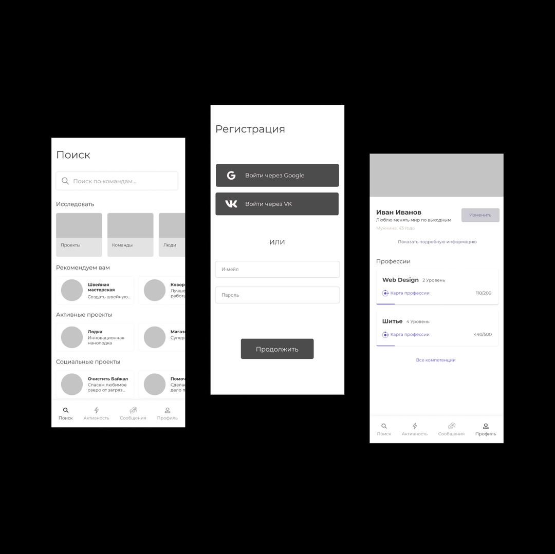
The first thing to do was create simple prototypes in order to quickly tweak the design and not think too much about beauty.
Here we discussed, trying to display the ideas that we had.
———
Usability-testing
To make the service more accessible and more user-friendly, we conducted usability testing to determine what problems the user may face when we give him a task.
Thanks to usability testing, we realized that the names of the categories are not very clear and it is not always clear where the project is and where the team is.
After usability testing, you need to rewrite the problems, add them as tasks, and fix the design.
By the way, I recommend this template for usability testing in Notion it will help you keep track of all appointments and save data. I also recommend the books "Don't Make Me Think" and "Rocket Surgery Made Easy", in which Steve Krug tells in an accessible way how to successfully conduct usability testing.
———
Cart-sorting
As I already wrote, we had problems with categories. To solve such problems, smart people came up with cart sorting. We wrote categories on stickers and gave cards to people so that they would categorize them.
With this technique, we identified categories that were difficult to understand.
Usability testing is not difficult to understand and accept. But card-sorting raised doubts among some team members - "But the sample is not large" and "This is not statistically significant." Yes, indeed - the sample is small. But we use this method not to prove something but in order to determine what problems any person may have. And if they arise, then they can arise and another person, because we do not want to make a product only for a certain caste of people?
———
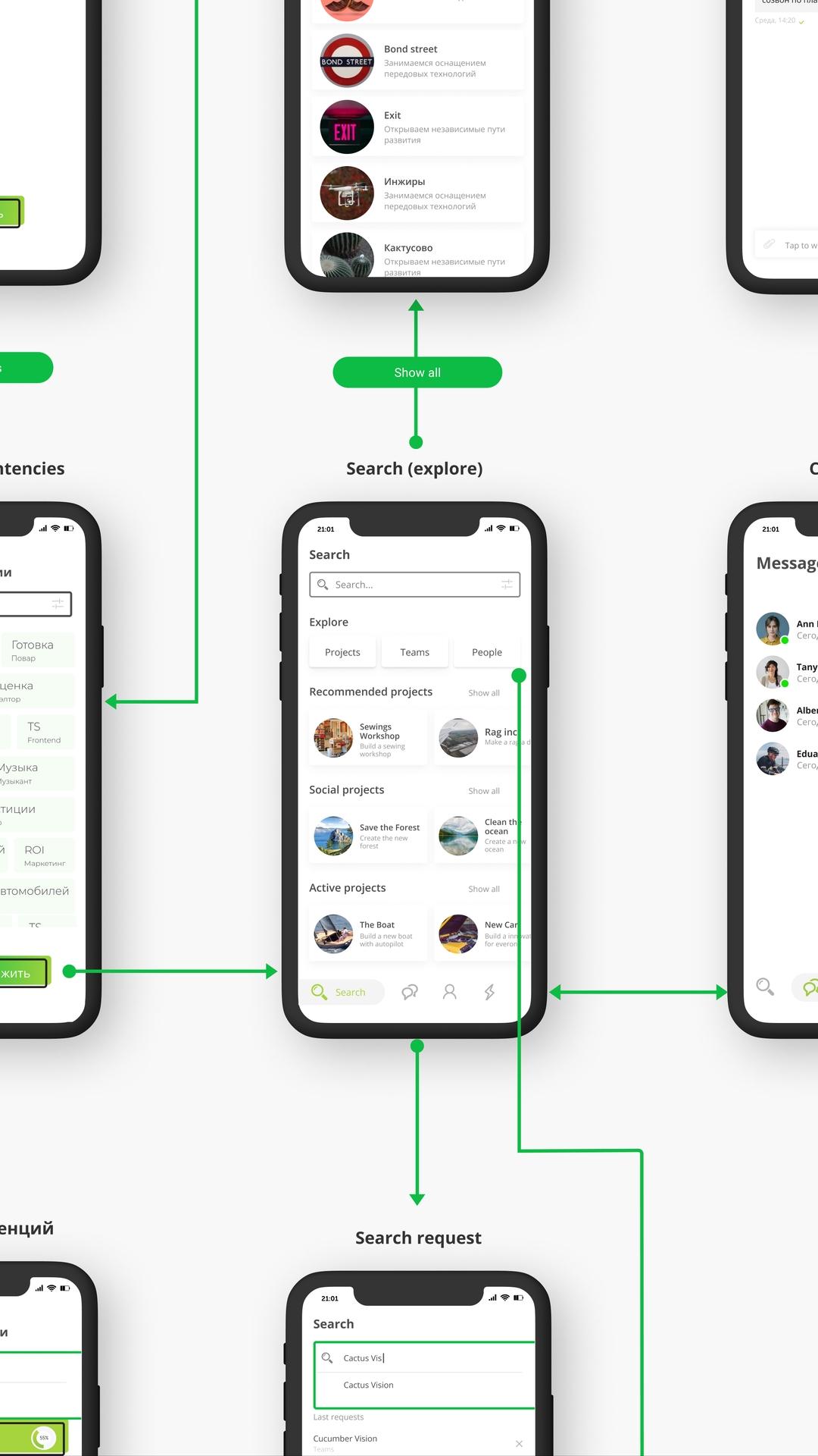
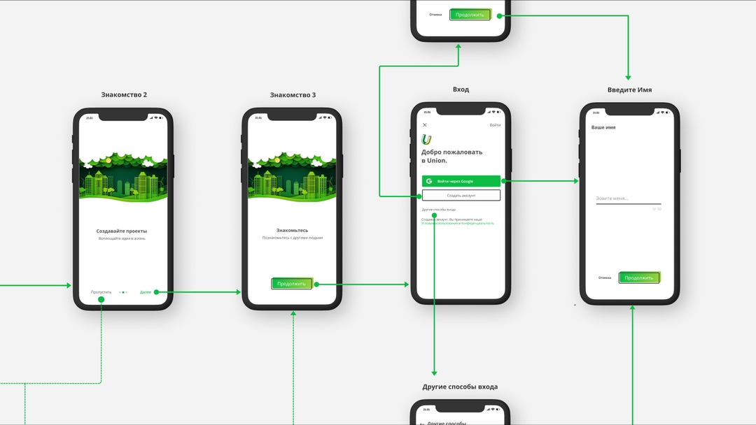
Screen map
In order not to forget anything, not a screen, not a little functionality. We have connected all screens to visually show the user's path.
When all this was done there was no such great Figma plugin as "Autoflow". He would greatly simplify our work, click on one screen, then on the second, and everything is connected.
———
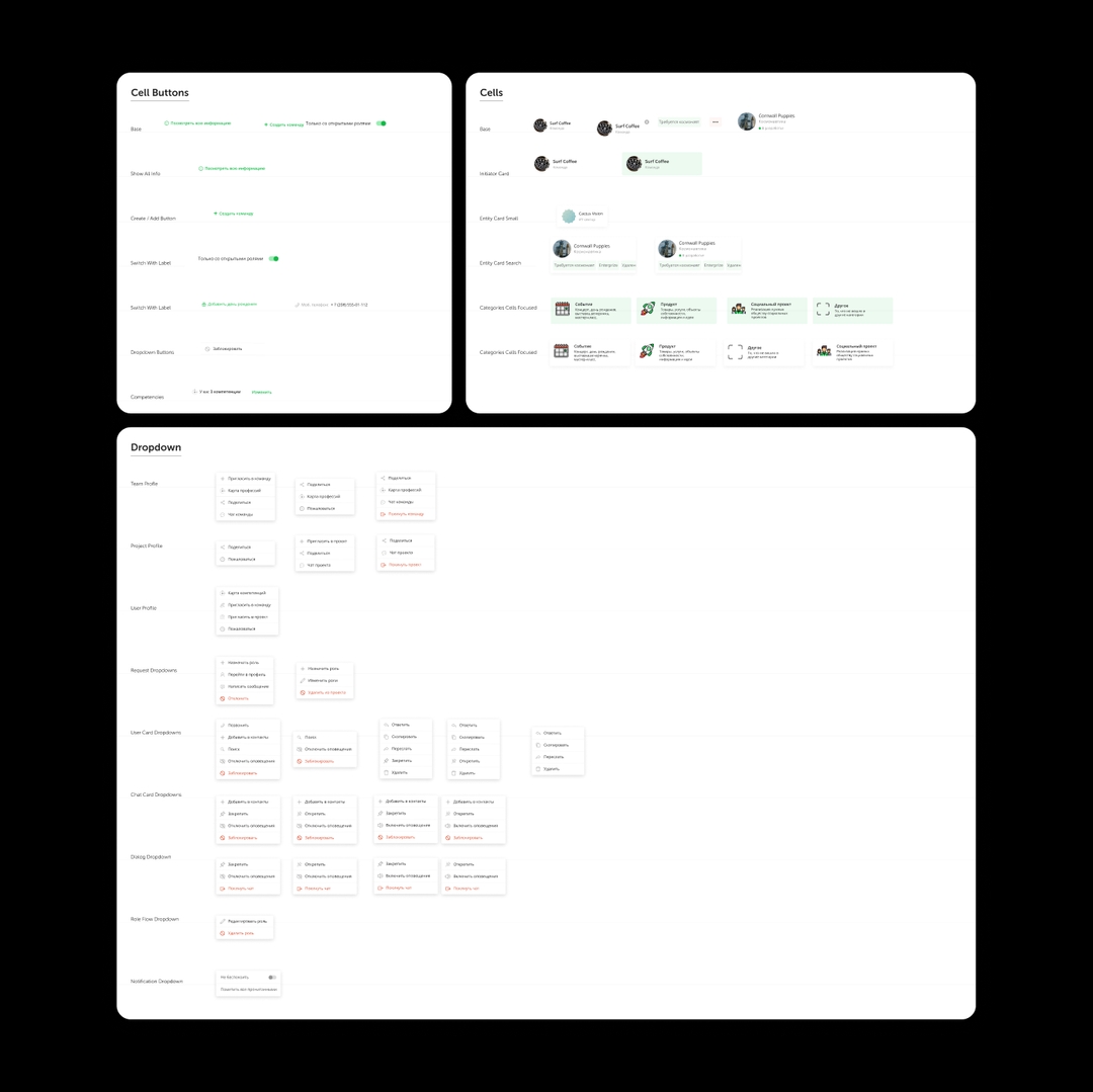
Component library
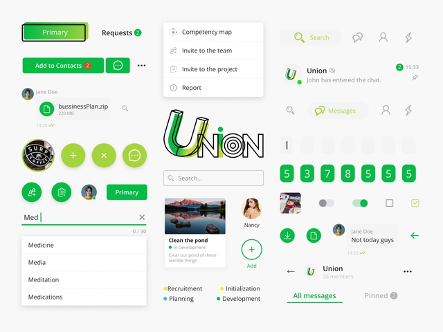
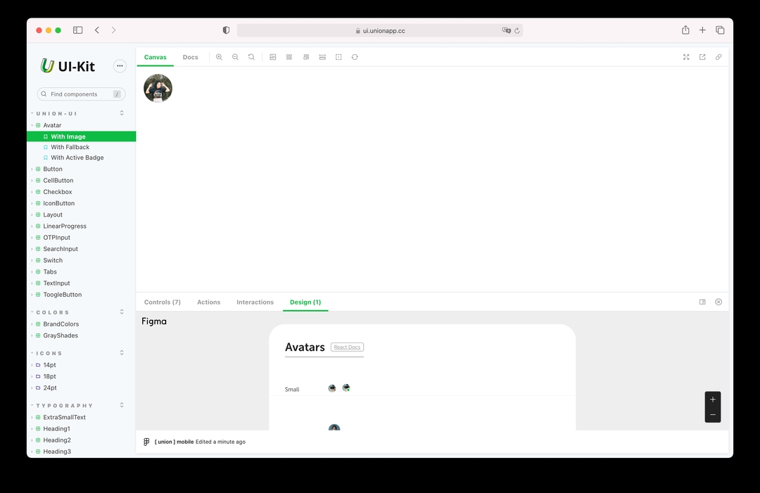
In order to make our design more flexible, we made a design system. Some may call it useless, but for such a large project it is a necessity. When the design of the system is flexible, you can change one component and others will follow - those on which it depends.
This design system has helped and will help designers.
———
Final Designs
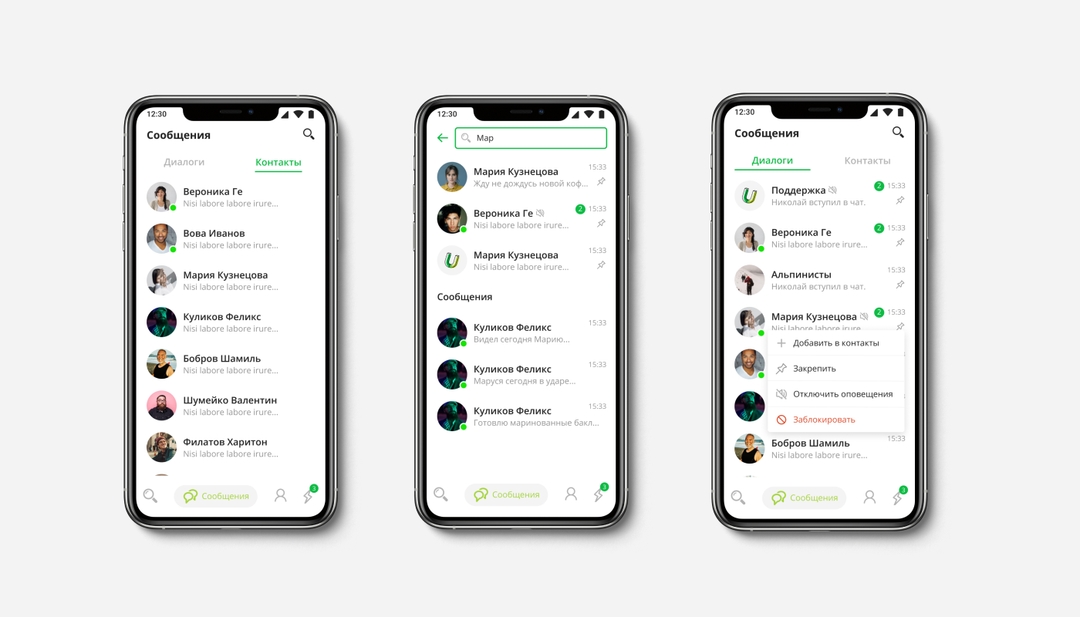
Now you can start creating layouts. When you have a good library of components, you can imagine playing Lego, quickly pulling components, and assembling layouts.
At this stage, it is important to conveniently put layouts on pages, so that it is convenient for designers, product managers, and developers alike.
———
Results
As a result, we got layouts ready for development and subsequent iterations, and a ready-made design system will help make edits much faster.
