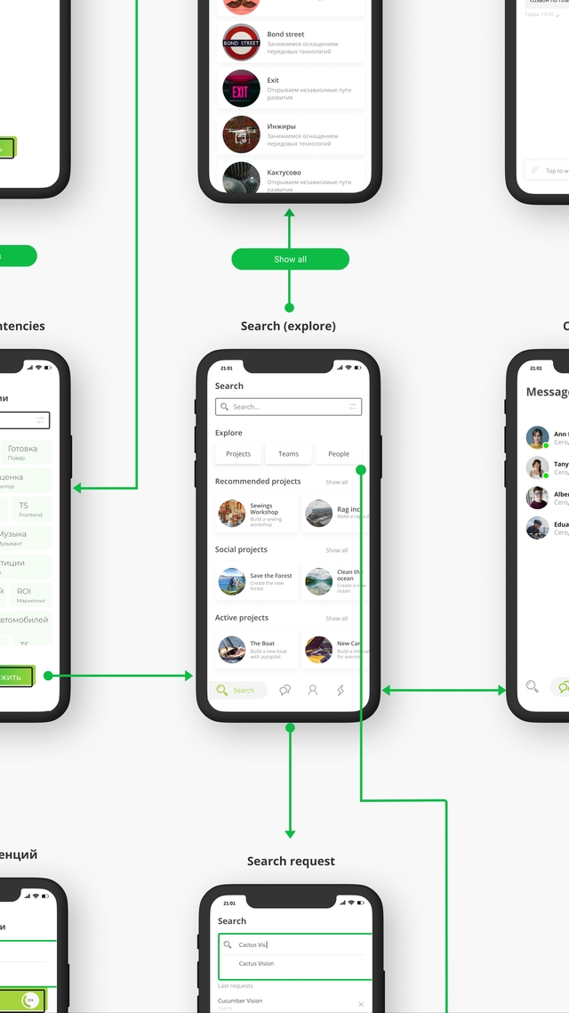
Cactus Vision — branding and identity
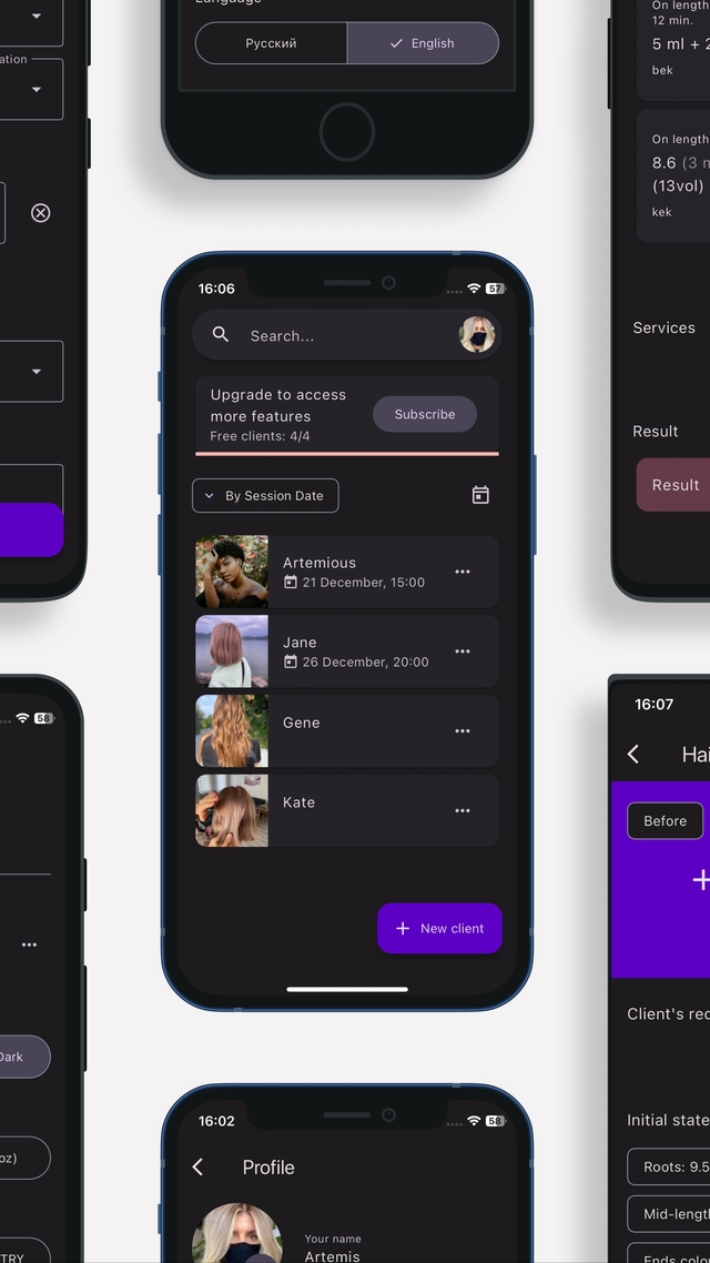
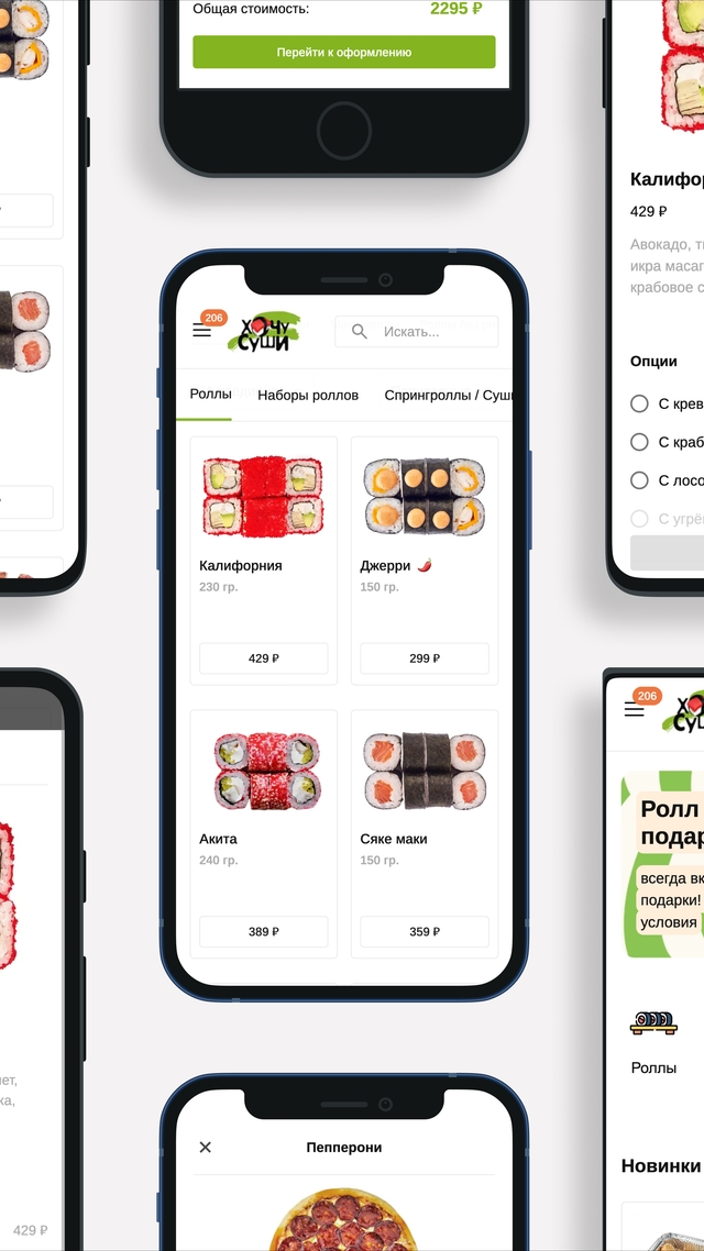
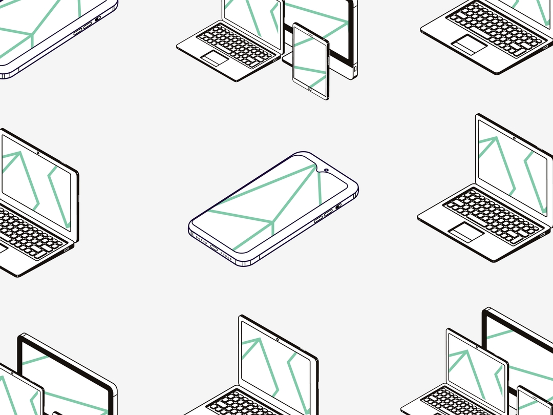
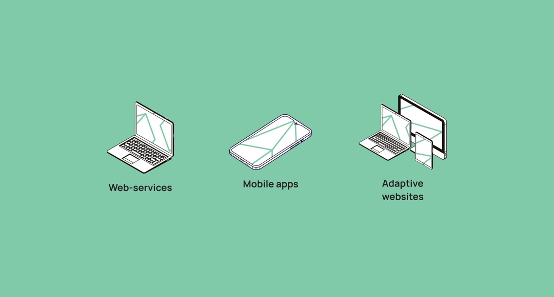
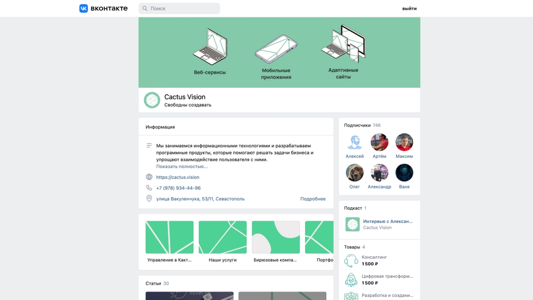
Cactus Vision, a digital agency, wanted a unique look that showed off their creativity and reliability. They specialize in making mobile apps, websites, and web services.
2021
Challenges:
- Making a look that matches Cactus Vision's creative vibe.
- Creating rules to make sure everything looks the same everywhere.
- Designing graphics for all their services.
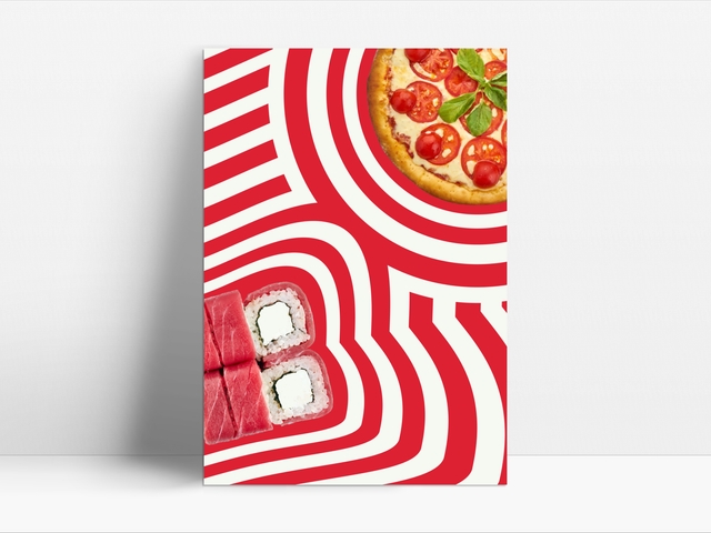
- Making easy posters for social media.
- Keeping all the rules in one place so everyone can use them.
—————
Process:
- Learning and Research: We learned all about Cactus Vision's brand and who they wanted to talk to. This helped us understand what they stand for and what makes them special.
- Coming Up with Ideas: We tried different looks, fonts, and colors to find what felt right for Cactus Vision. We wanted something modern and clear but also fun.
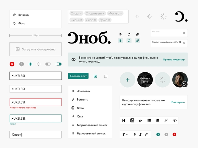
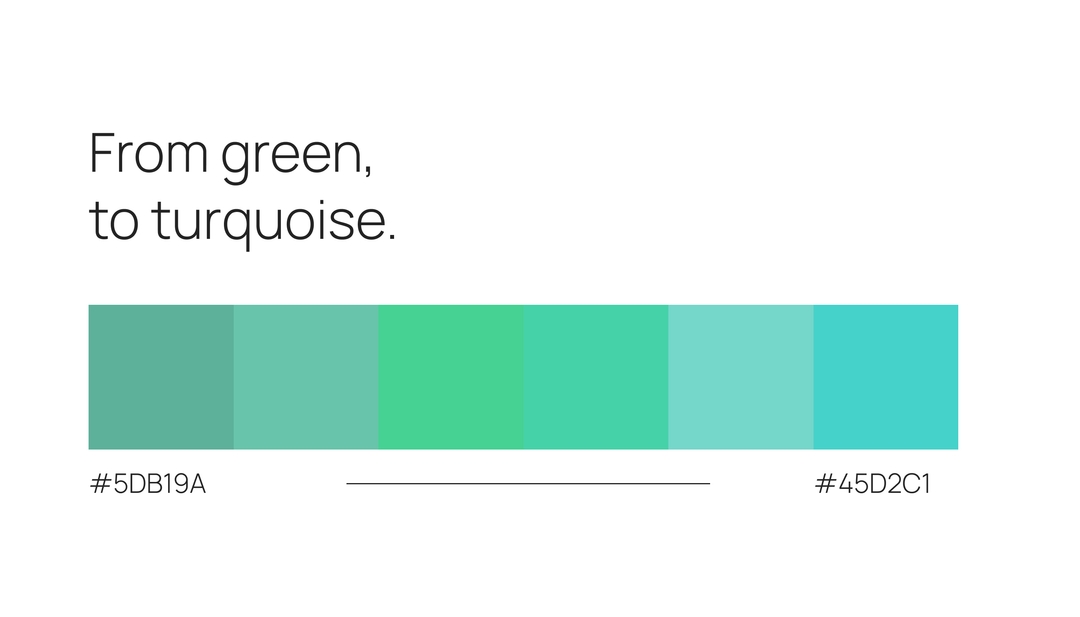
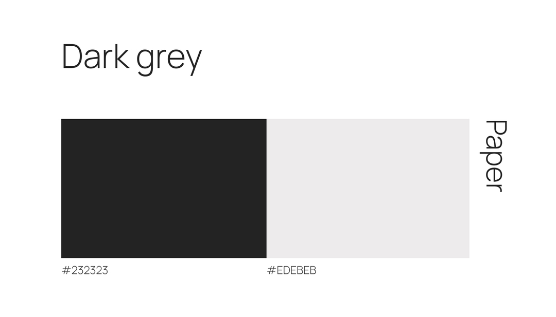
- Fonts and Colors: We picked fonts that looked clean and easy to read.
- Making Things Easy to See: We organized the design so that important stuff stands out.
- Talking in the Right Way (Tone of voice): We chose words that feel friendly but still serious. This makes people feel good about working with Cactus Vision.
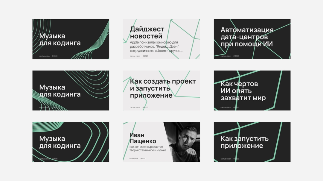
- Making Graphic Icons: We make graphic icons to show what Cactus Vision does. Each one is unique and easy to understand, making the brand memorable.
- Simple Social Media Posters: We made templates for social media posts that anyone can use. Just change the colors and add a picture, and you're good to go.
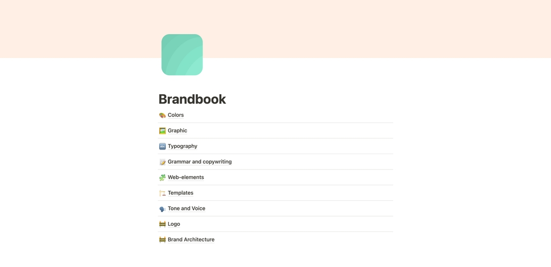
- Keeping Everything Together: We put all the rules and designs in one place so that everyone knows how to use them. This makes it easy to keep everything looking the same.