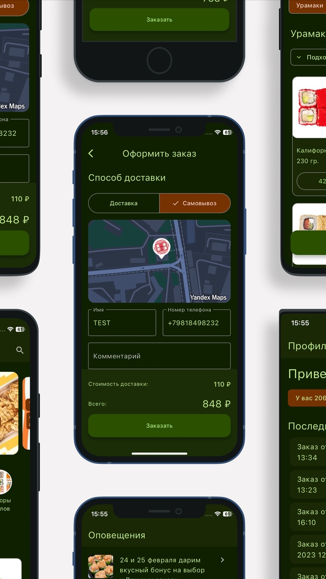
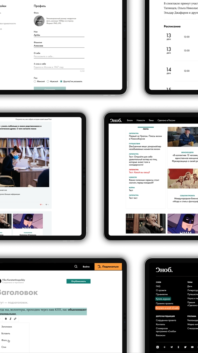
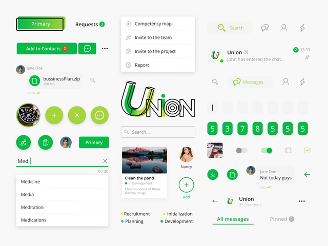
Snob UI
Snob.ru, a prominent online platform, sought to elevate its user experience by revamping its user interface (UI) and ensuring consistency across all pages. To achieve this, they embarked on a project to develop a Figma UI library that encapsulated their brand identity, prioritized accessibility, and facilitated seamless collaboration among designers and developers.
2020
Key features:
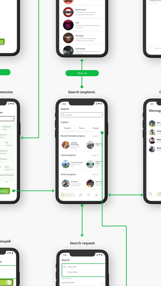
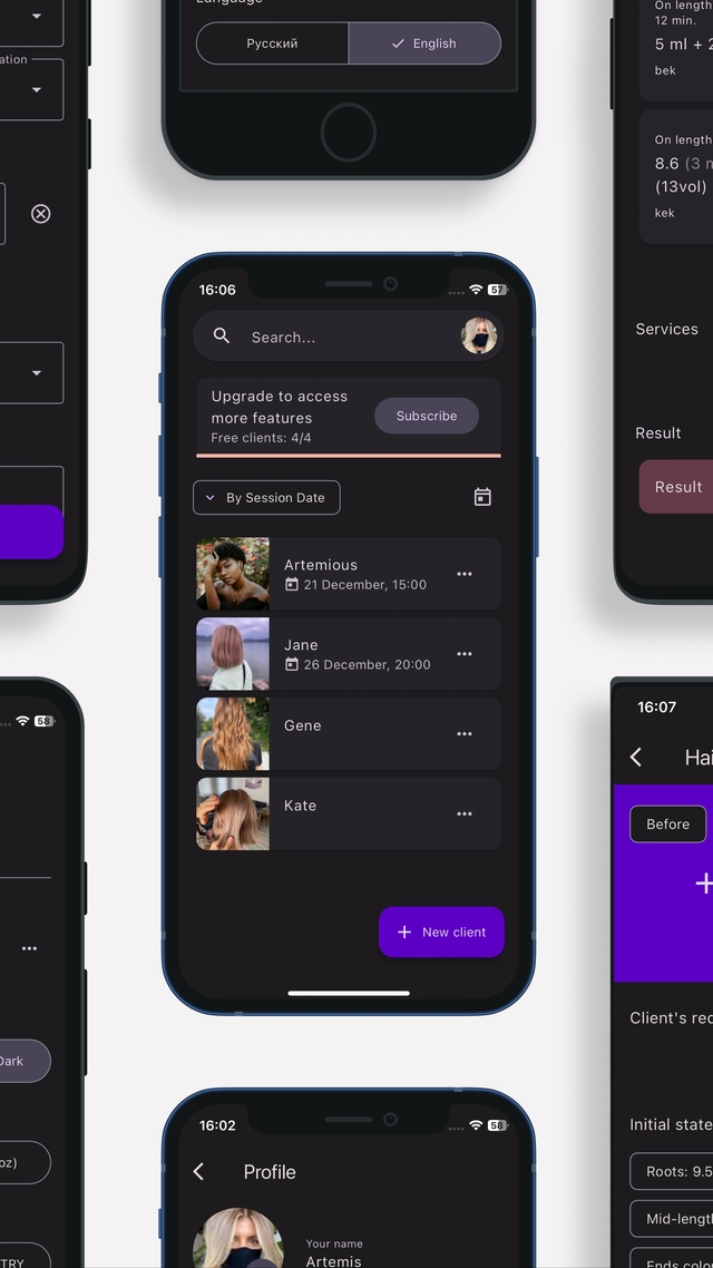
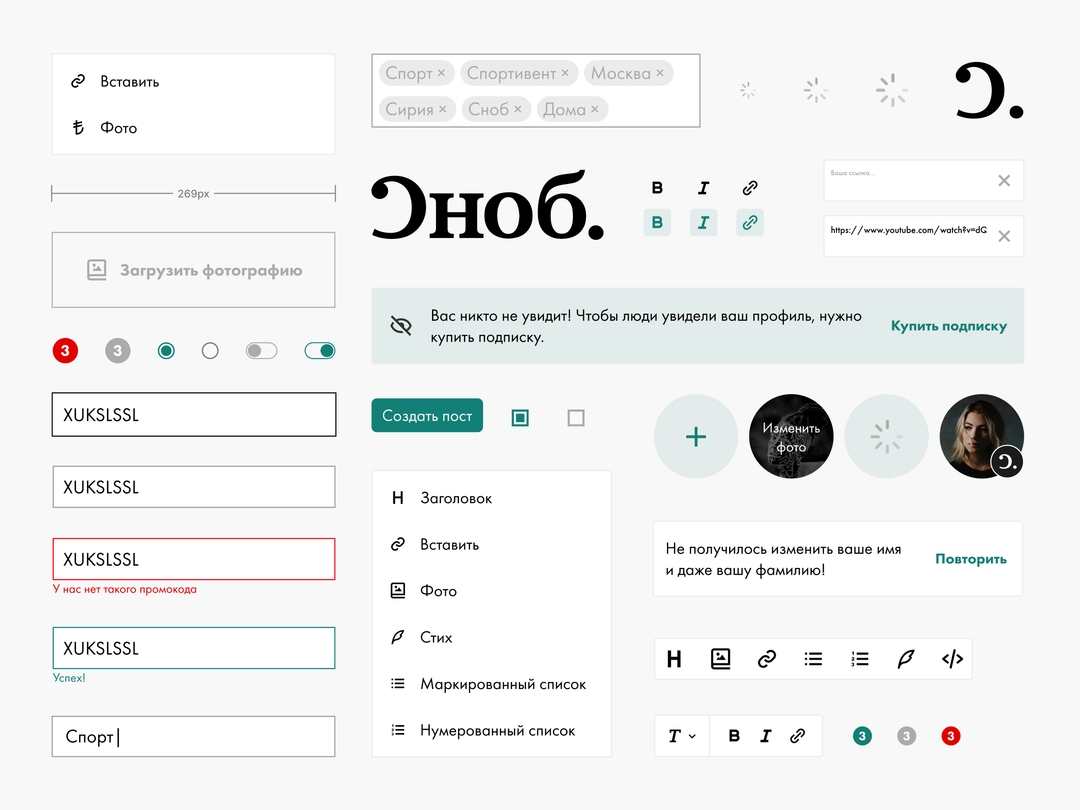
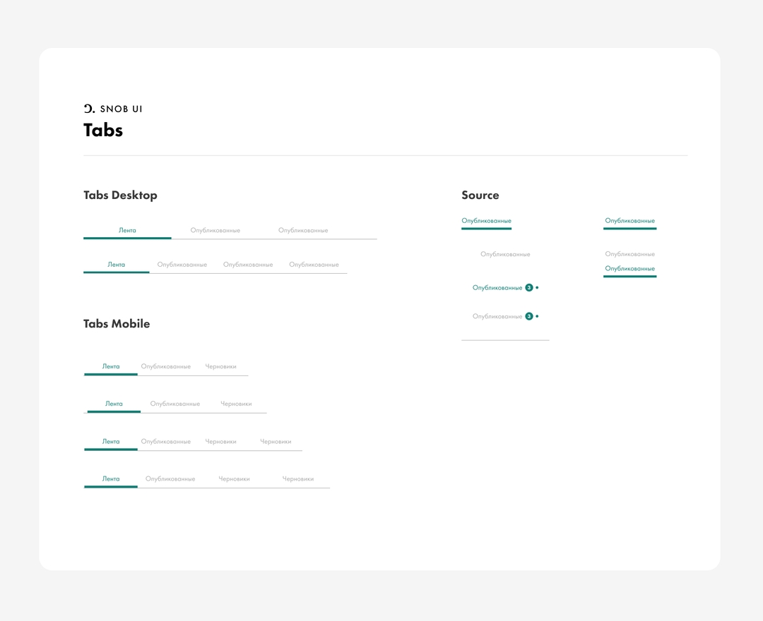
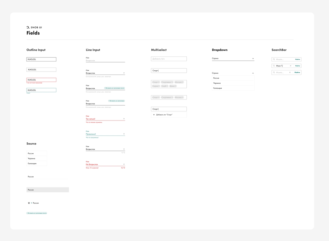
- Consistent Design Language: Developed a comprehensive design system that standardized UI elements across all pages, ensuring a cohesive user experience.
- Unique and Recognizable UI Elements: Crafted distinctive UI components that aligned with Snob.ru's brand identity, fostering brand recognition and memorability.
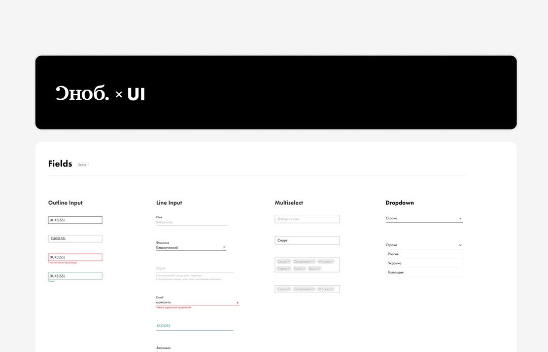
- Documented Components: Documented all UI components within the Figma library, enabling easy sharing and ensuring consistency across all design files.
- Accessibility and UX Focus: Prioritized accessibility by implementing accessible design practices, such as sufficient color contrast, keyboard navigation, and clear user feedback.
- Adaptive Design: Designed UI elements to be responsive, ensuring seamless usability across various devices and screen sizes.
- Color and Typography Documentation: Established a standardized color palette and typography guidelines, facilitating brand consistency and enhancing readability.
- Efficient Handoff Process: Simplified the handoff process by organizing and labeling components within the Figma library, making it easy for developers and designers to access and implement.