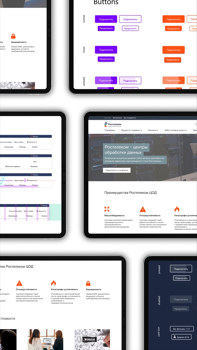
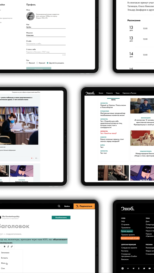
Union UI
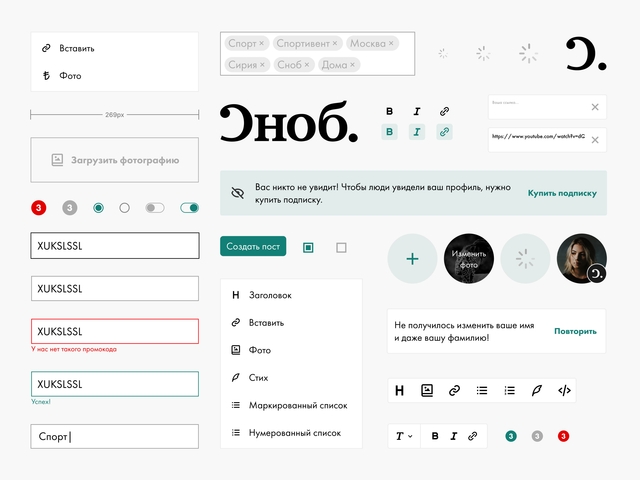
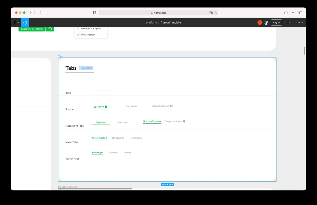
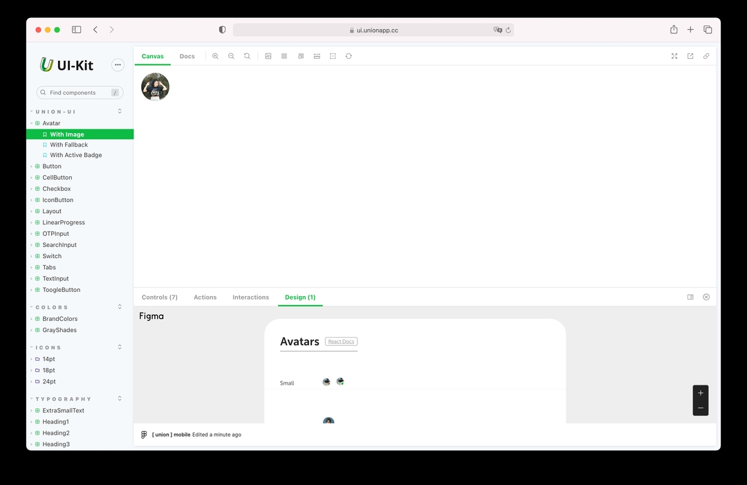
To keep the design system consistent you need to make sure that it looks exactly as in the code. I’m working in Figma. We developed a design system in Storybook for the Union project and connected it to Union’s Figma UI library.
2020
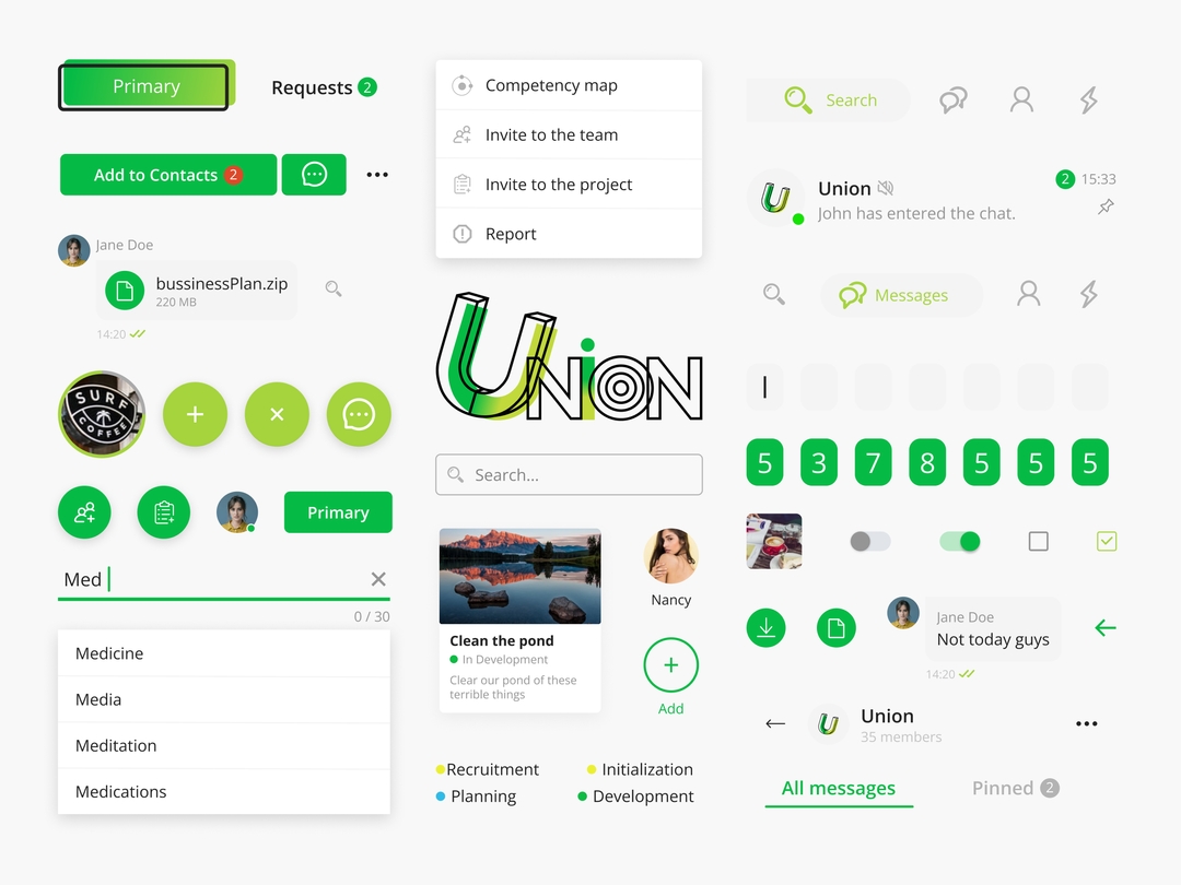
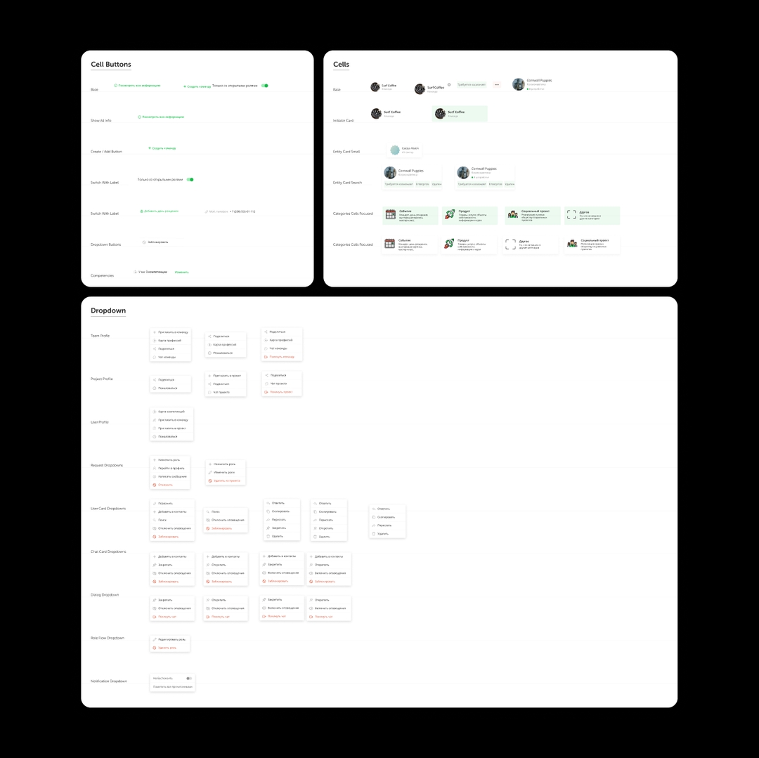
Some of the features of the UI library we created:
- Storybook Integration:
- Integration with Storybook facilitates synchronization between design and development.
- Design changes made in Figma are reflected instantly in the Storybook.
- Developers can efficiently implement design updates, reducing discrepancies.
- Atomic Design Principles:
- Colors, typography, and components are documented systematically.
- Atomic design principles ensure consistency and scalability.
- Design elements are organized into atoms, molecules, organisms, templates, and pages for easy reference.
- Responsive Components:
- All components are designed to be responsive across mobile, tablet, and desktop devices.
- Extensive testing ensures optimal user experience on different screen sizes.
- Flexibility and adaptability are prioritized to accommodate diverse user needs.
- Usability and UX Focus:
- Design decisions prioritize usability principles to enhance user experience.
- Intuitive navigation and clear visual hierarchy guide users effectively.
- Feedback mechanisms and interactive elements improve user engagement.
- Comprehensive Documentation:
- Detailed documentation accompanies each component, including usage guidelines and best practices.
- Developers and designers can easily reference documentation for implementation and design decisions.
- Documentation ensures consistency and facilitates the onboarding of new team members.
- Design Tokens:
- Colors, typography, spacing, and other design tokens are defined and documented.
- Design tokens ensure consistency across the UI library and Union's digital platform.
- Modifications to design tokens are reflected consistently throughout the design system.
- Accessibility Compliance:
- Components are designed and tested to meet accessibility standards.
- Considerations for screen readers, keyboard navigation, and color contrast are integrated into design decisions.
- Accessibility features ensure inclusivity and compliance with industry regulations.
- Seamless Handoff to Developers:
- Design assets are easily exportable from Figma for implementation.
- Code snippets and guidelines accompany each component for developers' reference.
- The handoff process is streamlined, reducing communication barriers between designers and developers.