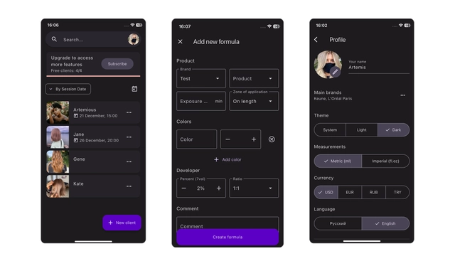
Two-Pane Scheduling
Chromatic • SaaS
Overview
Redesigned a scheduling tool used daily by professionals by introducing a two-pane layout that eliminated constant page switching and significantly sped up high-frequency tasks.
Product: Chromatic — SaaS appointment scheduler & hair formula editing app
Users: Hair professionals managing clients
Role: Product Designer + Flutter implementation
The Problem
Managing appointments required switching between two separate screens:
Calendar - open client - edit - go back - repeat
Result:
- excessive clicks
- lost context
- slower task completion
- frustration during busy periods
My Role
Led UX improvements and collaborated with engineers to design and implement a more efficient layout optimized for desktop power users.
Approach
- observed real booking workflows
- mapped most frequent actions (edit, reschedule, check details)
- counted navigation steps
- identified repetitive back-and-forth as the main bottleneck
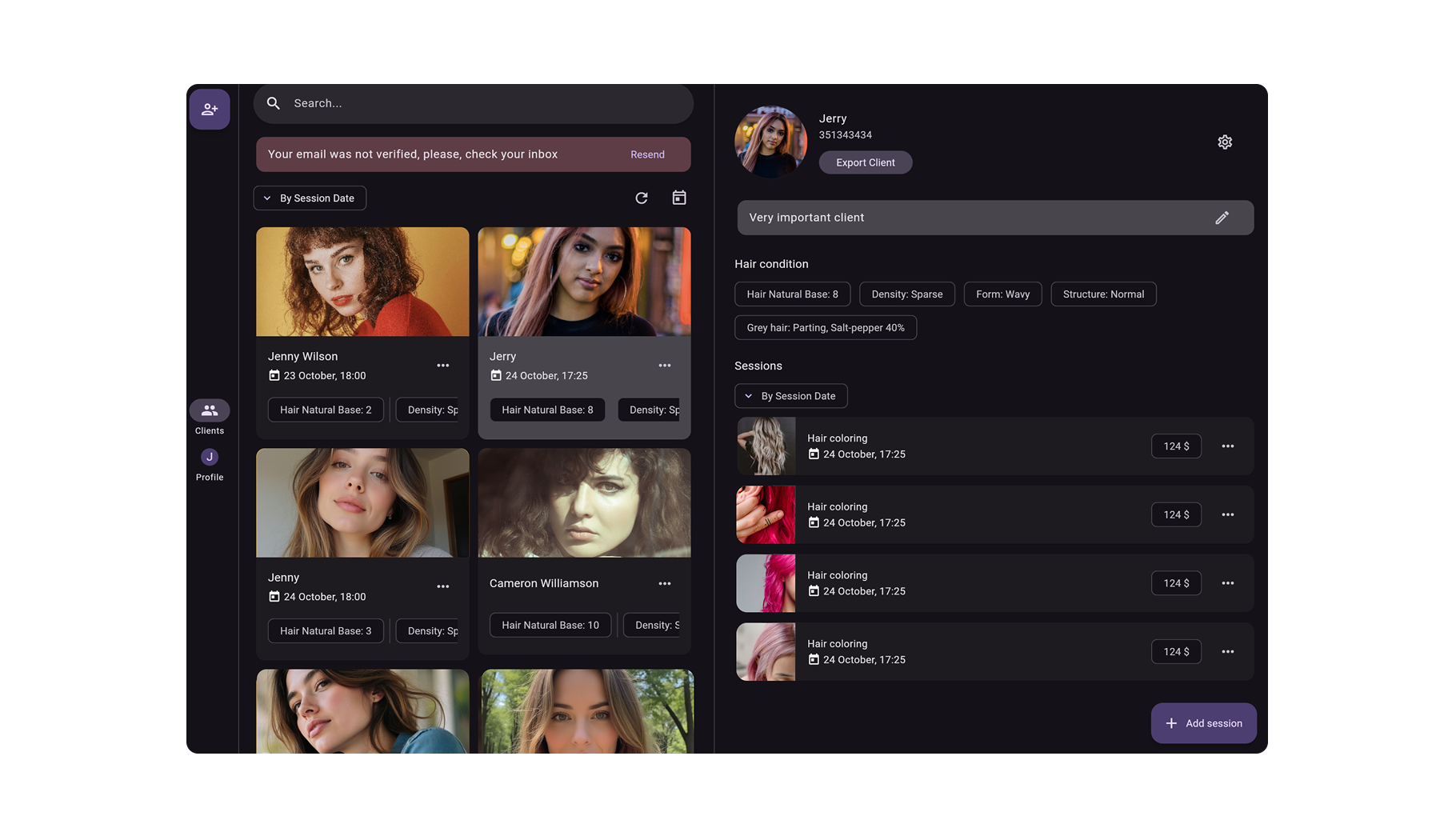
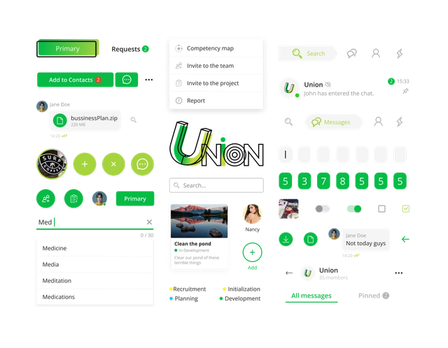
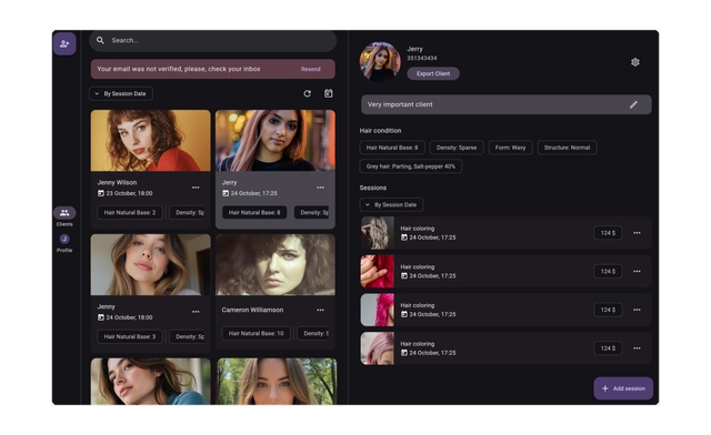
Solution
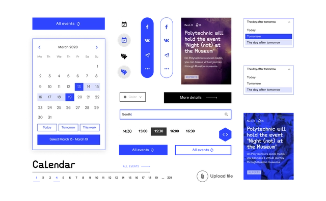
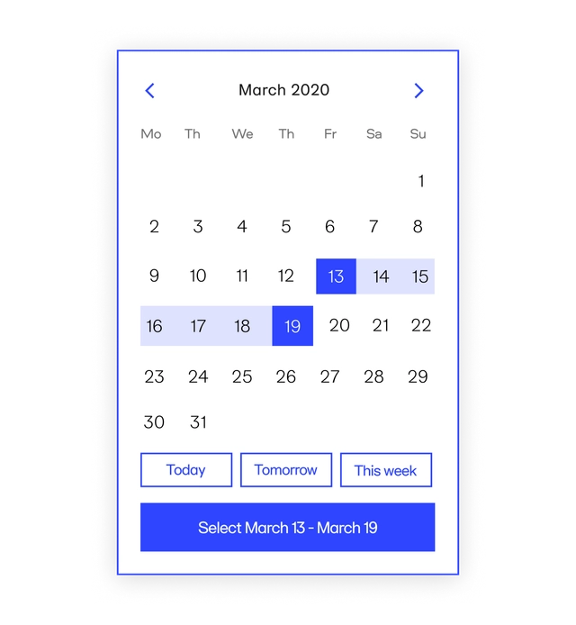
Introduced a two-pane interface:
Left: Calendar/List of Clients
Right: Client/appointment details
Key decisions:
- persistent schedule visibility
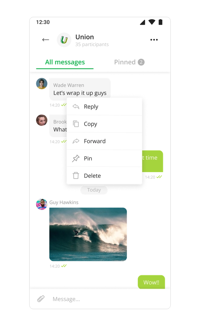
- inline editing
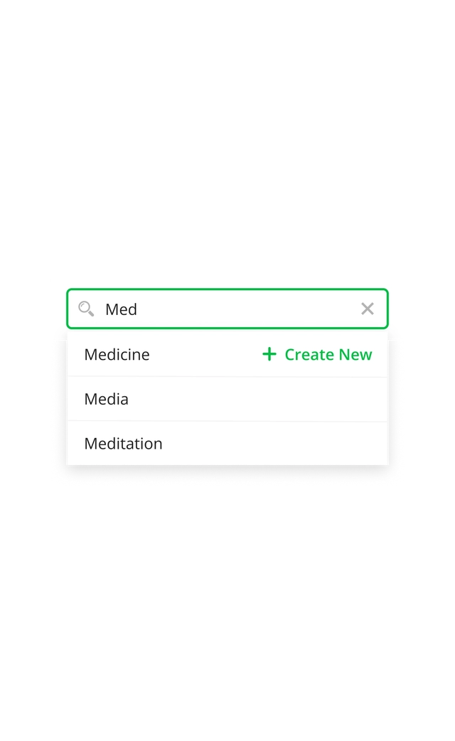
- quick actions without navigation
- fewer full-page transitions
Outcome / Impact
- steps reduced from 4+ to 1–2 per task
- faster booking management
- smoother workflows during peak hours
- improved daily efficiency
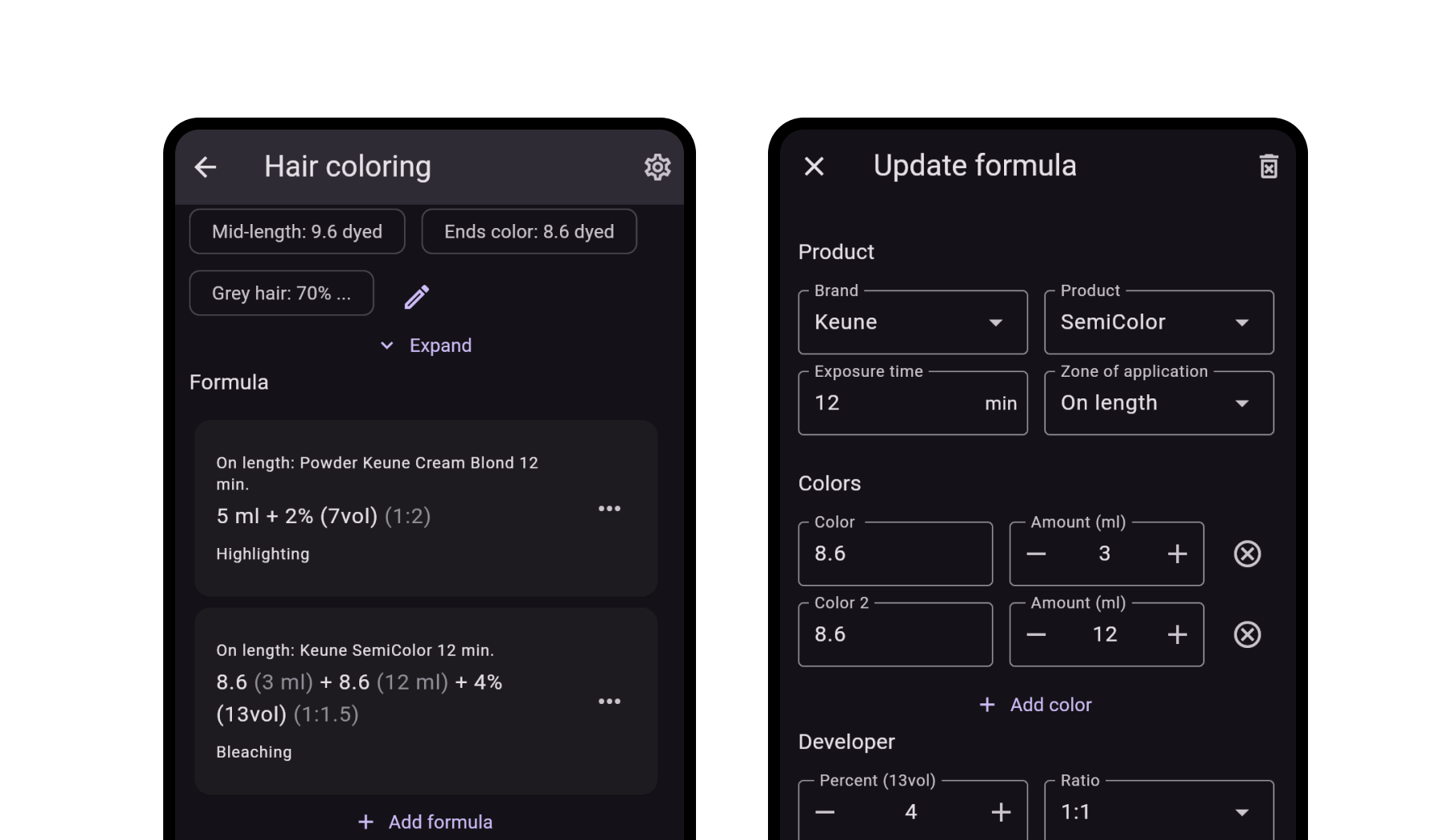
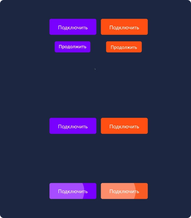
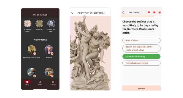
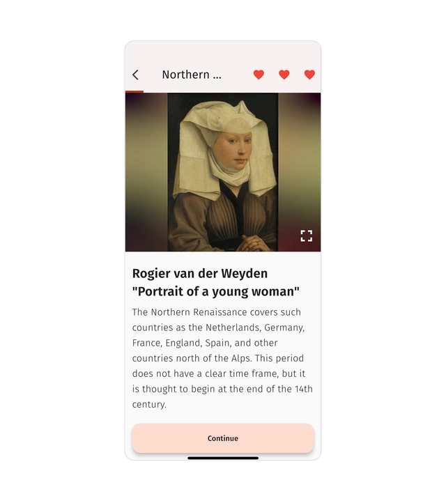
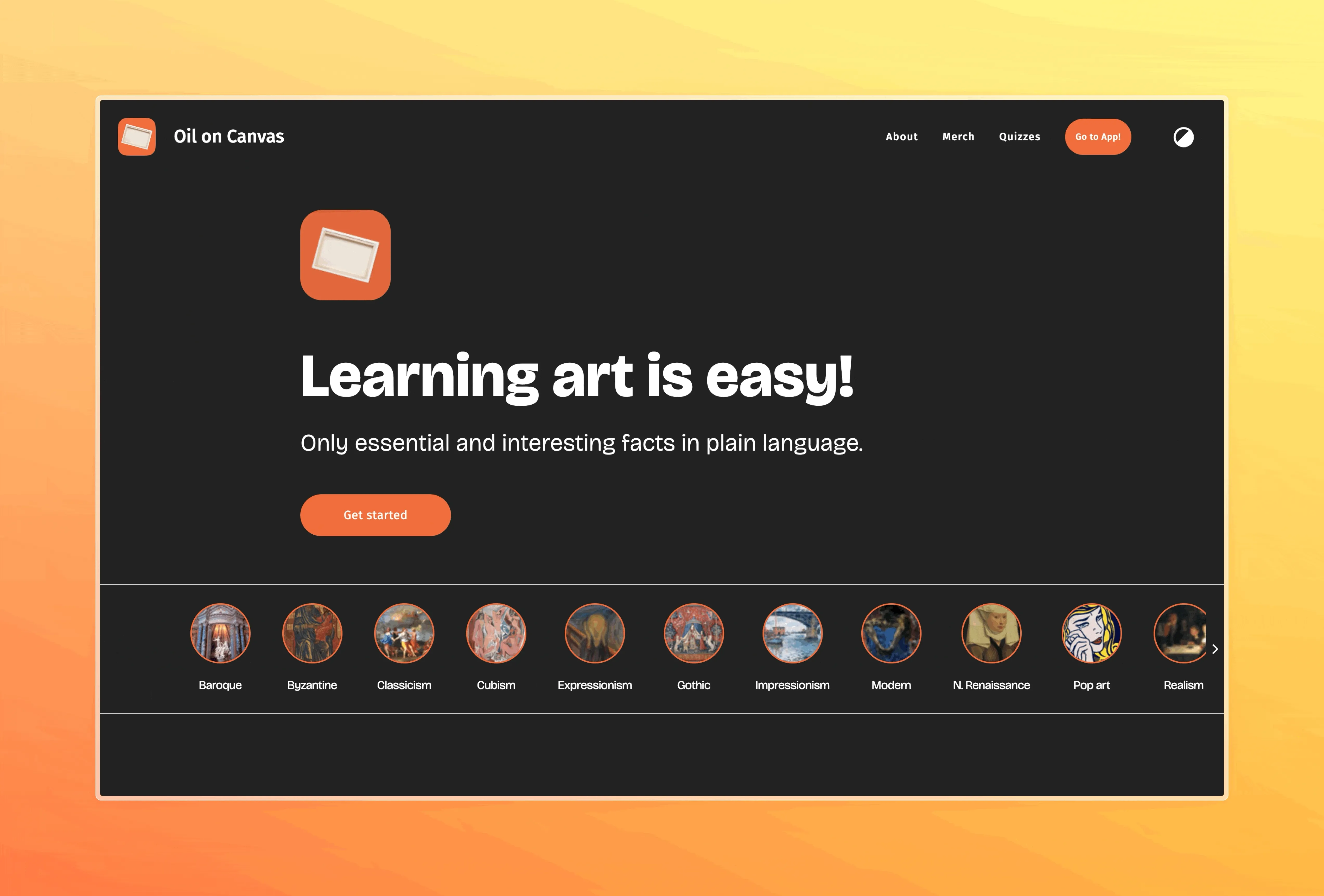
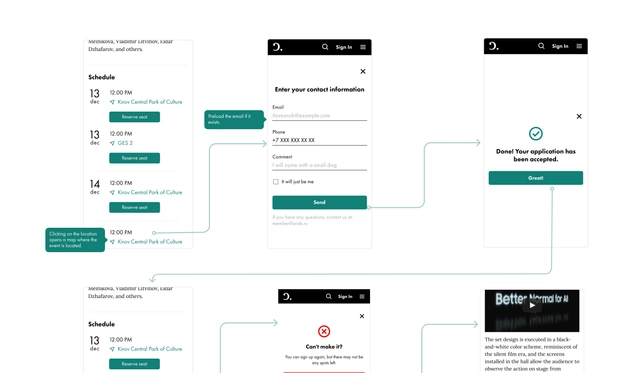
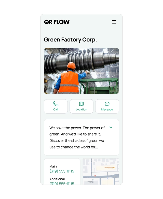
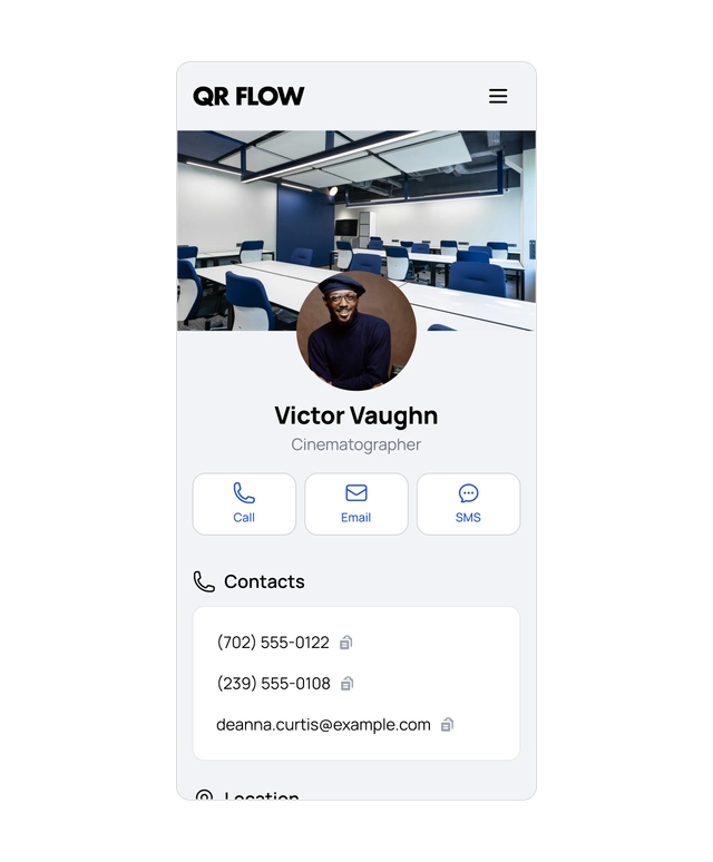
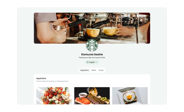
Visuals