Designing QR Flow from scratch: one system for 13 QR types
From March to August 2024, I designed QR Flow from scratch: a SaaS platform for creating, customizing, managing, and tracking QR codes. Working with a product manager and developers, I owned the complete UX and visual design, from the creation flow and management dashboard to responsive microsites and a reusable component system.
- Role
- Contract Product Designer
- Period
- March–August 2024
- Ownership
- End-to-end UX and visual design
- Scale
- 13 QR types · 24 responsive microsite designs · 1,900+ components and variants
The challenge: one platform, very different outputs
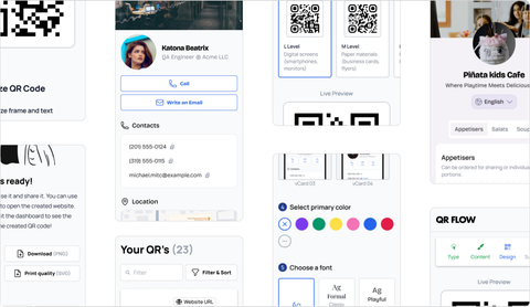
QR Flow was conceived as more than a QR-code generator. The product needed to help people create different types of QR codes, manage them after publication, and understand how often they were scanned.
It supported two distinct kinds of output:
- five direct actions: website, email, SMS, Wi-Fi, and PDF;
- eight customizable microsites: business information, event, link list, image gallery, social profile, video, vCard, and menu.
Both had to fit one understandable creation journey and one management dashboard. The microsites added another layer of complexity: localization and visual customization had to support personal expression without compromising usability, readable contrast, or the product’s restrained identity.
My role: end-to-end product design
I joined QR Flow as a contract designer from March through August 2024, working with a product manager and developers. I owned the complete UX and visual design of the product.
My work included competitor analysis, product architecture, user flows, responsive interface design, microsite templates, localization behavior, customization rules, analytics and management screens, the component system, and design–development handoff.
At the concept stage, I used competitor analysis, founder requirements, and interviews with the founders to understand the intended audience, business model, visual direction, and technical constraints. These inputs gave us a practical starting point, while the product assumptions would still need validation with users.
One creation model for 13 QR types
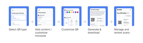
Instead of designing a separate workflow for every type, I created a shared staged journey: select the QR type, add the required content, customize the QR code, and finish. The structure stayed familiar while the fields and preview changed according to the selected output.
Direct-action types only showed the inputs needed for that action. Microsite types progressively introduced structured content, localization, and microsite customization. A live preview beside the form showed how each change affected the published result without forcing users to switch between editing and preview modes.
Customizing the QR code itself
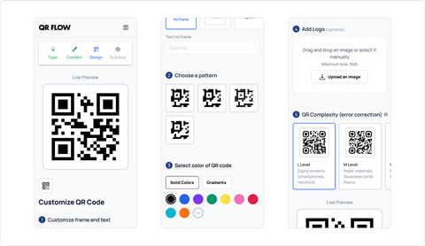
Microsite customization and QR-code customization were separate layers. Every creation flow included a dedicated Customize QR step where users could choose a frame and label, select a visual pattern, apply a solid or gradient color, add an optional logo, and set the error-correction level.
I divided these controls into five numbered groups and kept a live QR preview visible beside them. The technical error-correction setting was paired with short use-case guidance, translating specification-level terminology into a practical choice.
A dashboard for ongoing management
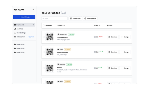
The dashboard treated a QR code as something users continued to manage, rather than a file they downloaded once and forgot.
Users could search, filter, and sort their QR codes; pause, restart, or delete them; and download the generated code when needed. Each item also surfaced its scan count, providing a simple analytics layer without separating routine management from performance information.
This part of the product required a different density from the creation flow. The dashboard needed to support repeated operational tasks, make status visible, and keep destructive actions clear without overwhelming people managing many codes.
Controlled customization instead of an open-ended page builder
The hardest design problem was customization. Users needed to create microsites that could represent a restaurant, wedding, professional profile, event, gallery, or social presence. At the same time, the founders wanted QR Flow to retain a restrained, monochromatic, minimalist identity.
Giving users unrestricted control would have made it easy to produce poor contrast, inconsistent hierarchy, or layouts that no longer felt connected to the product. Removing customization would have made the templates too generic.
I approached this as a system of controlled choices:
- predefined template structures constrained hierarchy and content placement;
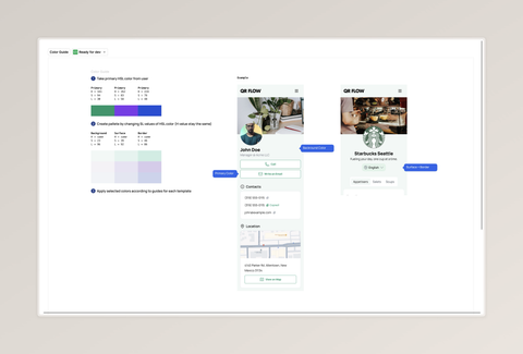
- a selected base color generated a coordinated palette for primary, background, surface, and border roles;
- color roles helped preserve hierarchy and readable contrast across templates;
- three curated font directions—neutral, formal, and playful—covered different contexts without introducing an unmanageable font library.
The result was not a page builder. It was a structured customization system that gave users meaningful choices while protecting usability, accessibility, and the QR Flow identity.
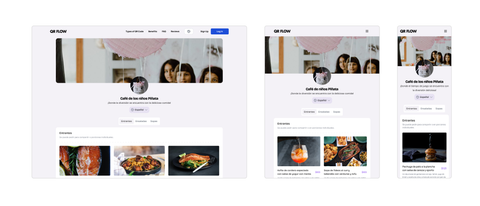
Eight microsite types across three target widths
The eight microsite types were each designed at three target widths—1440 for desktop, 1080 for tablet, and 360 for mobile—producing 24 responsive template designs.
The first localization iteration focused on Latin-script languages. I designed flexible text containers, content-aware spacing, and layouts that could absorb longer translations without clipping or breaking the hierarchy.
The same rules had to work across very different content: short contact details, long event descriptions, restaurant menus, image collections, link lists, and embedded media. Treating these pages as variations of one system made responsive and localization behavior more predictable than maintaining every template independently.
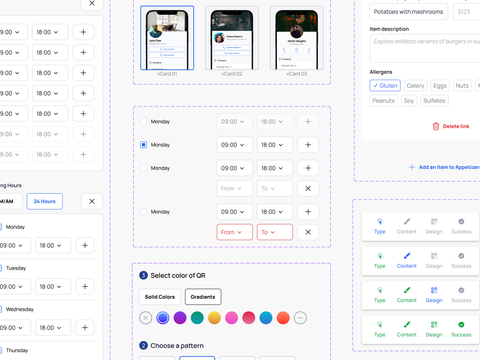
Mapping 1,900+ components and variants to implementation
Designing the interface and system in parallel produced more than 1,900 Figma components and variants. They captured form controls and states, navigation, dashboard patterns, QR customization, responsive content modules, microsite sections, and repeated template structures.
The developers were implementing the product with NextUI, so I mapped the design hierarchy, states, and variants to that foundation rather than treating Figma as an independent visual specification. This created a shared language for discussing how each pattern should behave in code and reduced ambiguity during handoff.
Delivered scope
The contract ended while the product was being implemented. By that point, I had delivered the design foundation and the developers had begun implementing it through NextUI. It covered:
- one staged creation model spanning 13 QR types;
- eight microsite types across three target widths, producing 24 responsive designs;
- dashboard search, filtering, sorting, status management, downloads, and scan counts;
- localization behavior for Latin-script languages and longer translations;
- controlled microsite color, typography, and layout customization;
- QR frames, labels, patterns, colors, logos, and error-correction settings;
- a 1,900+ component and variant system aligned with NextUI.
The most important result was coherence. Product flows, microsites, customization rules, and implementation components were designed as parts of one platform rather than as separate screens.
What I learned and would validate next
QR Flow reinforced that customization is primarily a rules problem. The more freedom a product offers, the more clearly it must define what remains fixed, what can change, and how quality is protected by default.
It also reinforced the difference between reducing implementation uncertainty and validating product decisions. A systematic design can do the former, but it cannot replace testing with real users. My next priority would have been testing whether people could identify the right QR type, complete the creation journey, and understand the customization choices without feeling overwhelmed. I would then simplify any options people did not understand or use.