Localization & Theming System for 24 QR Microsites
Overview
Designed a flexible UI system that allowed users to generate branded, localized QR microsites across multiple layouts, themes, and languages — while maintaining visual consistency, accessibility, and scalability.
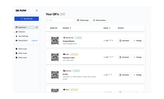
Product: SaaS QR platform
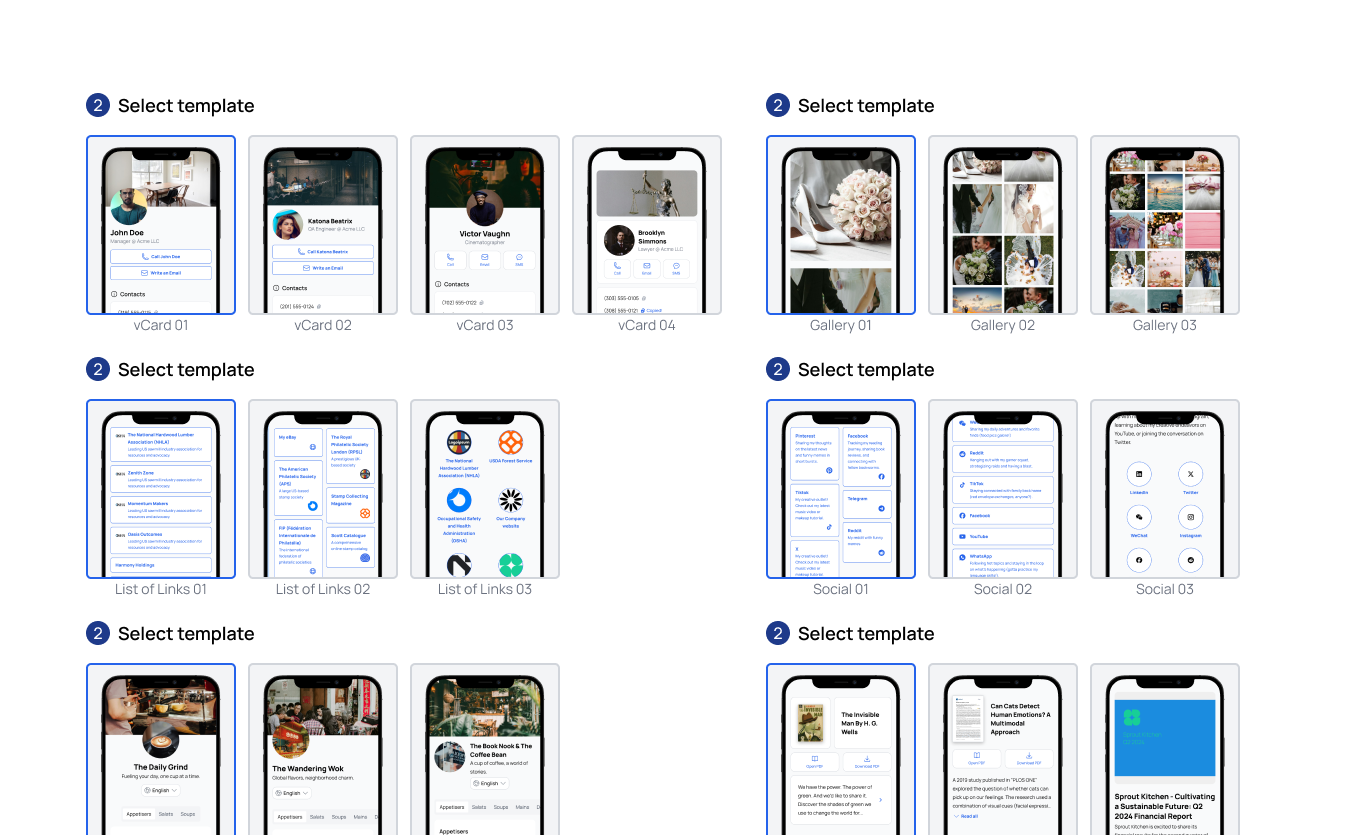
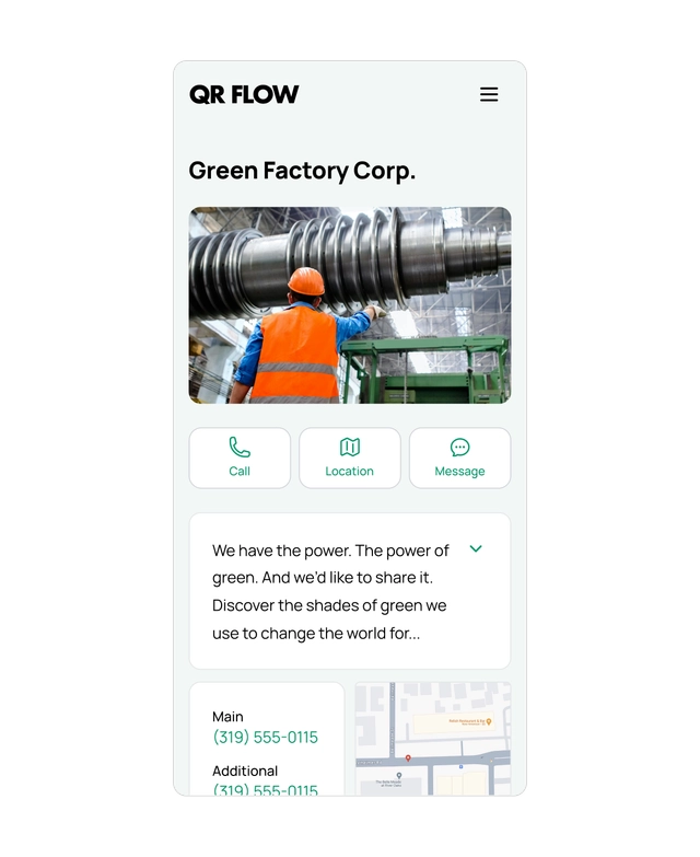
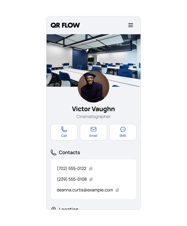
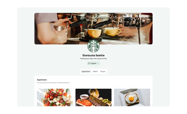
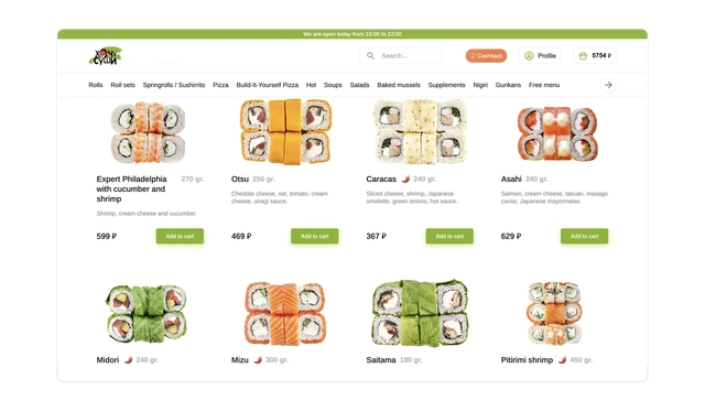
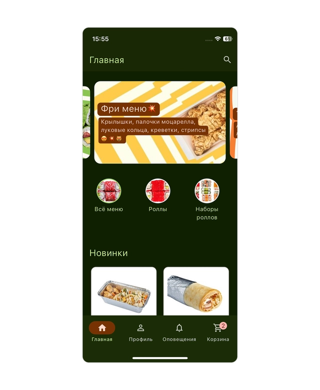
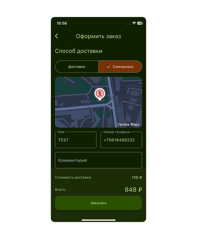
Scope: 8 QR types, each generating 3 small websites (menus, vCards, events, PDFs, etc.).
Role: Lead Product/UX Designer
The Problem
Each QR type generated its own mini-website with:
- multiple layouts
- customizable colors
- different fonts
- localization into multiple languages
This quickly created system complexity:
- components became hard to maintain across many variations
- arbitrary color choices could break accessibility or look inconsistent
- long translations broke layouts
- too many font options reduced visual cohesion
- every new template multiplied design effort
My Role
Owned the design system and customization architecture, defining rules and constraints that balanced flexibility for users with consistency and maintainability for the product team.
Worked closely with engineers to align design components with the frontend implementation.
Approach
Instead of treating each template as a separate design, I treated the platform as a system:
Key principles:
- constrain choices to protect quality
- design for unknown content lengths
- use tokens instead of hardcoded styles
- ensure accessibility by default
Solution
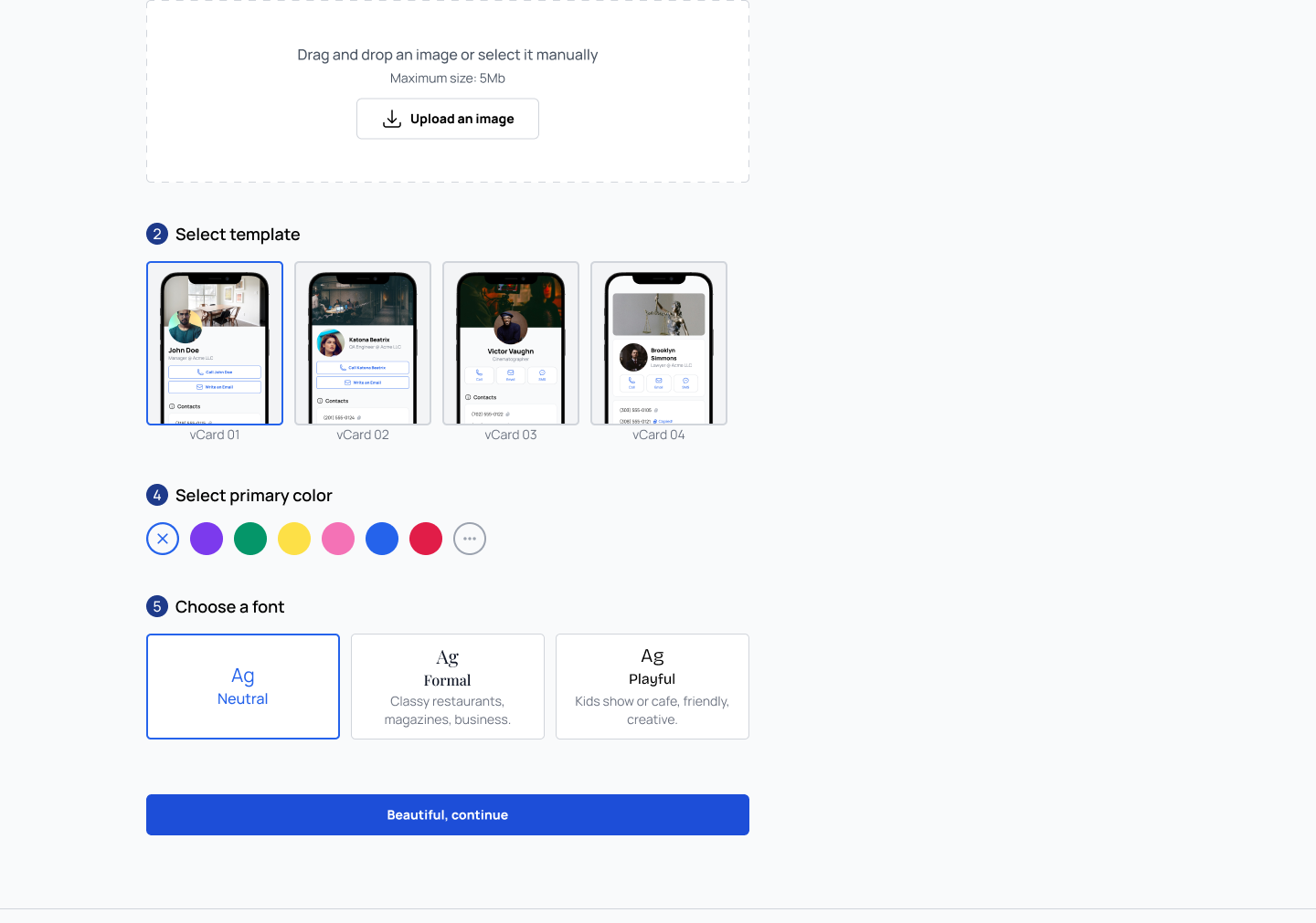
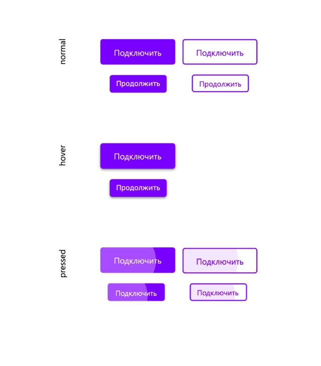
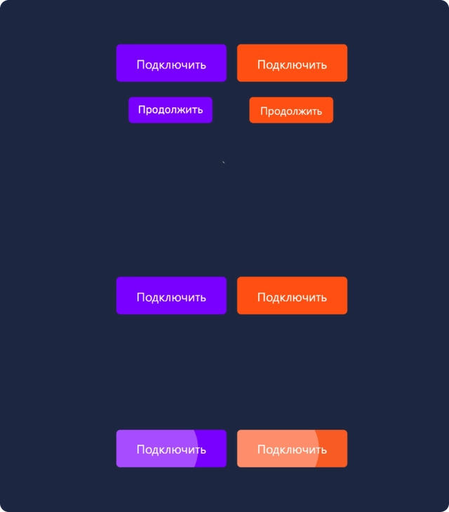
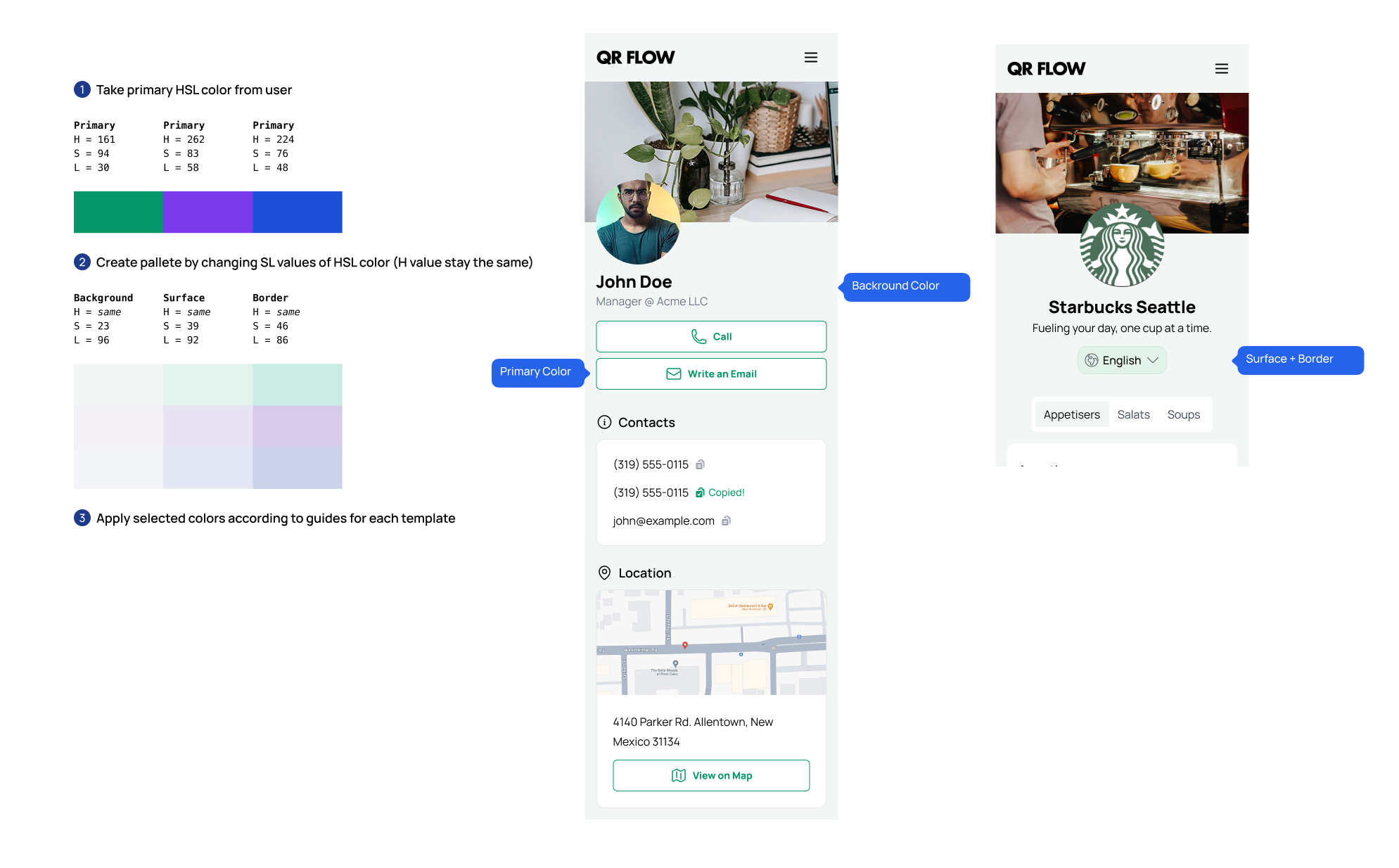
1. Color theming
- generated pallets instead of just colors
- ensured all combinations met WCAG contrast requirements with any color the user chooses
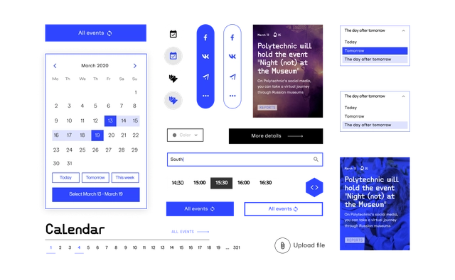
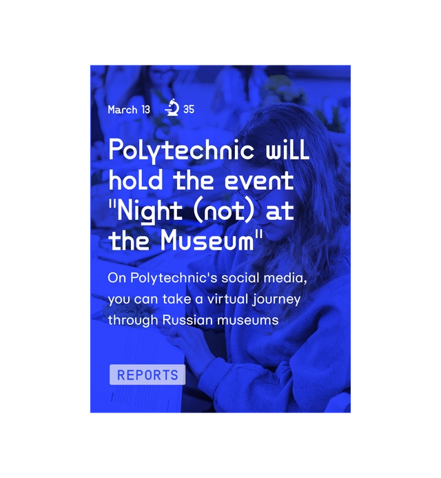
2. Localization
- responsive components
- content-aware spacing
- no fixed text widths
- designed to handle long/short translations safely
- easy to add/edit content in different languages
- language selector of end users
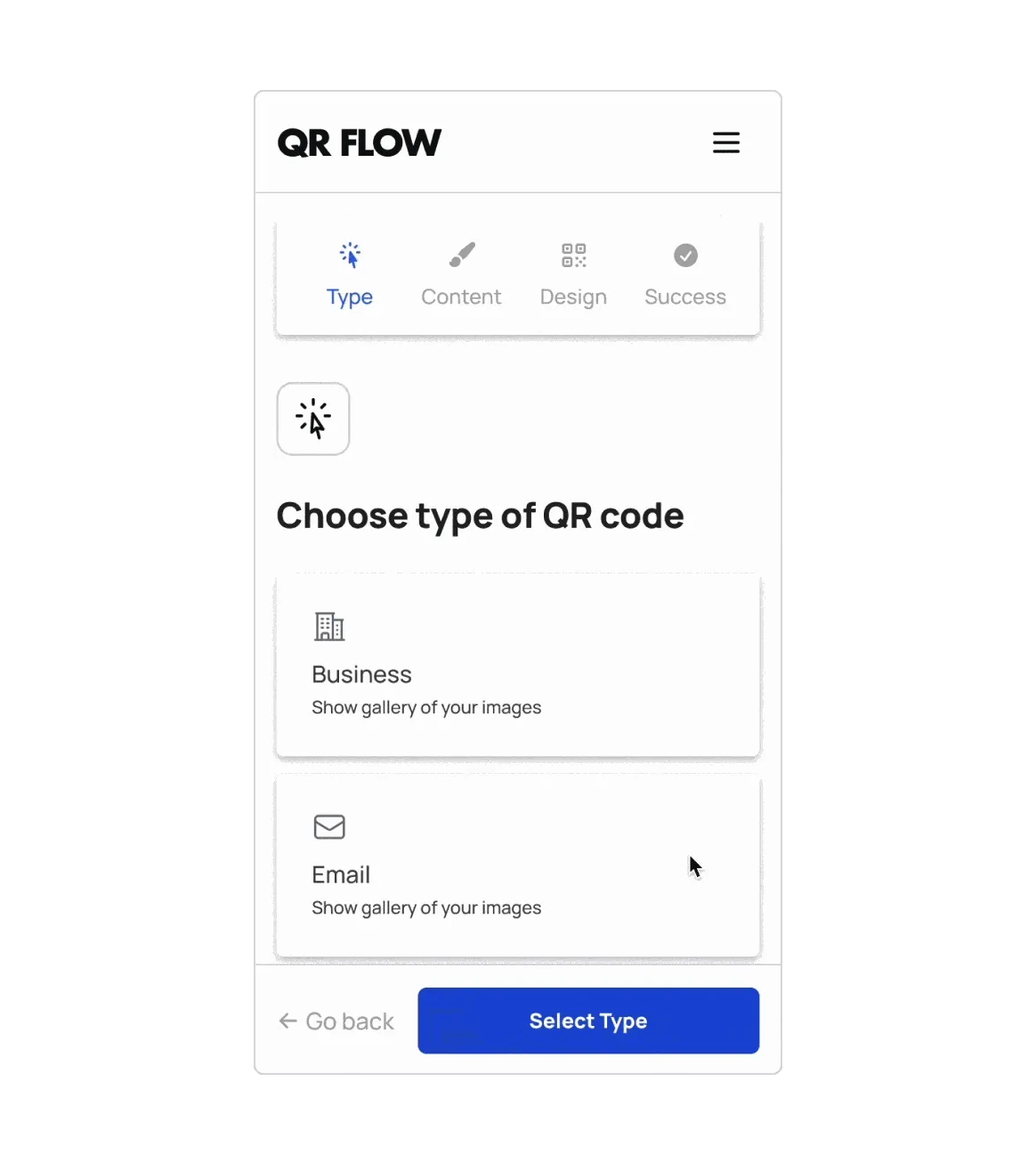
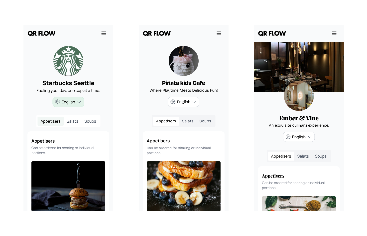
3. Structured customization
- 3 layouts per QR type (instead of unlimited variants)
- predefined style combinations to maintain consistency
- keep layouts customizable, while preserving QR Flow branding
4. Font strategy
Instead of many fonts, I introduced 3 curated options:
- Playful for kids, events, etc.
- Formal for weddings, business, etc.
- Neutral for general use
5. Design/code alignment
- mapped tokens/components to NextUI foundation
- ensured design system matched implementation
- reduced handoff time
Outcome / Impact
- scalable system supporting many QR types without visual chaos
- fewer design inconsistencies
- accessibility built-in by default
- easier localization across languages
- smoother design–engineering collaboration
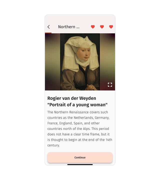
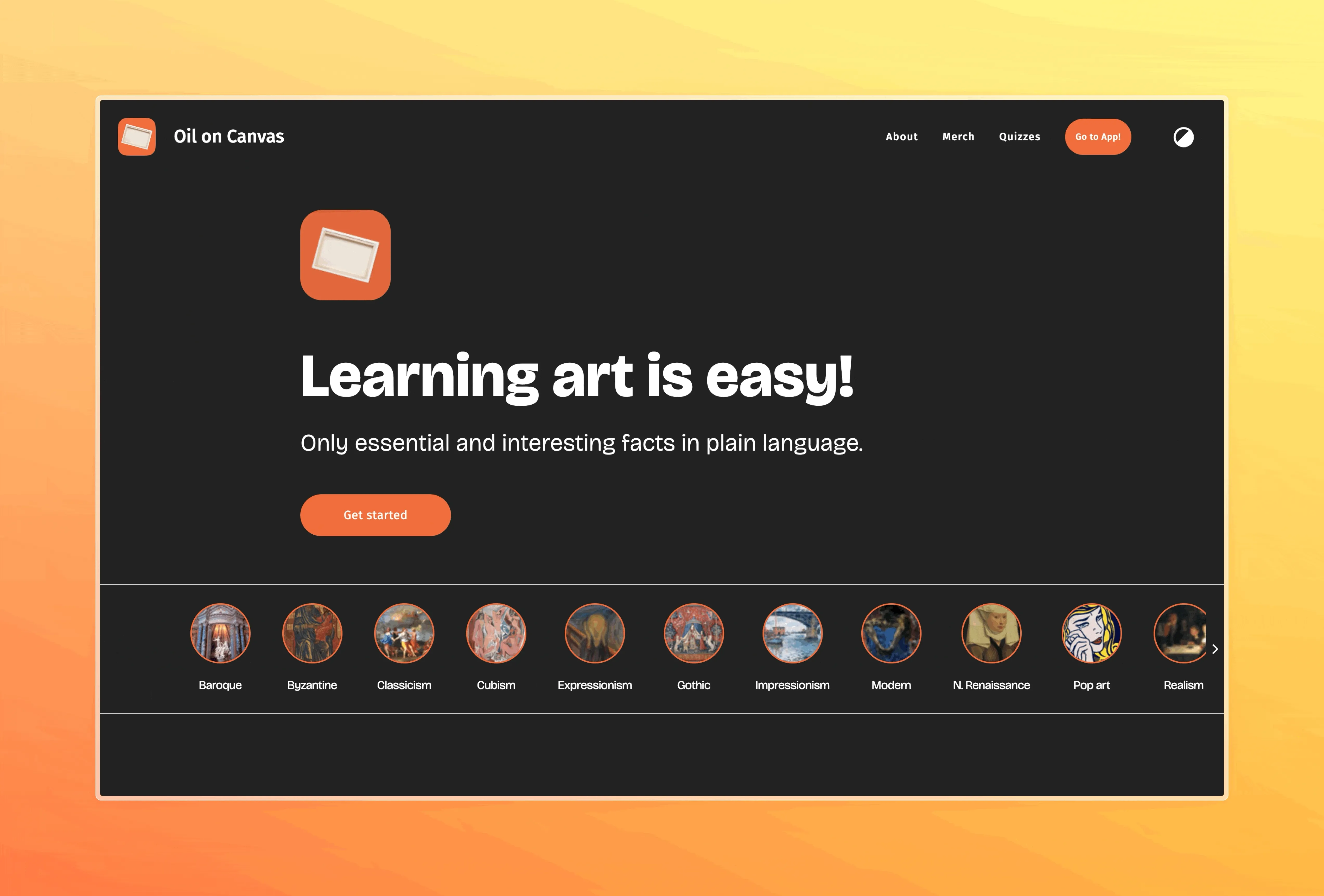
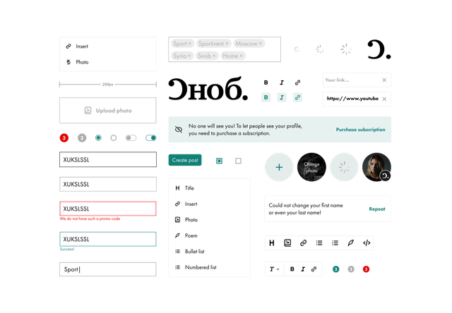
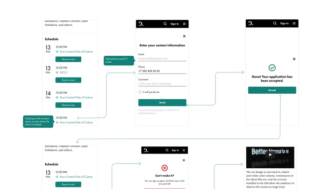
Visuals