Redesigning Snob.ru for 6M+ monthly visits
Since 2021, I have owned UX scenarios and visual design for the redesign of Snob.ru, a media platform with 6M+ monthly visits. Working with a cross-functional team, I redesigned reader and blogger journeys and built a library of 530+ components and variants used across approximately 50 pages.
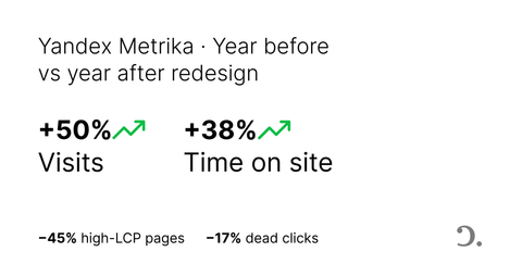
Comparing Yandex Metrika data for the year before the redesign with the year after it, visits increased by 50% and time on site by 38%. Focused follow-up improvements also reduced pages with high LCP by 45% and dead clicks on article images by 17%.
- Role
- Product Designer
- Period
- February 2021–present
- Ownership
- UX scenarios and visual design
- Scale
- 6M+ monthly visits; 530+ components and variants across approximately 50 pages
A redesign delivered in stages
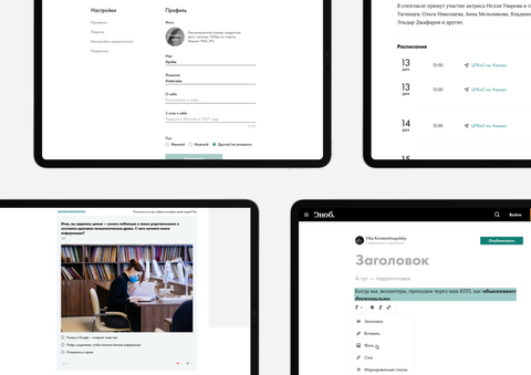
This was not a one-off visual refresh. We started in February 2021 with research and the redesign of Snob’s blogging product. The new blogging experience launched at the end of 2021.
From 2022 through 2023, we redesigned the rest of the website and continued improving features already released. I now maintain the system and work on new features, accessibility, and focused UX and performance improvements.
The staged approach let us release value without waiting for the entire legacy platform to be rebuilt. It also gave us time to learn from each release and reuse successful patterns across later sections.
My role in the team
I worked with a product manager, developers, a data scientist, advertising and SEO experts, the commerce team responsible for partnerships and special projects, and an editorial representative.
I owned the UX scenarios and visual design. My work included mapping flows, defining page and interaction logic, designing responsive interfaces and states, maintaining the component library, and working with developers through implementation.
My main tools were Figma for interface and system design, and Yandex Metrika, Google Analytics, and Microsoft Clarity for behavioral analysis.
An established product with accumulated UX debt
Snob.ru publishes articles, interviews, opinion pieces, blogs, quizzes, events, and special projects. With more than 6 million monthly visits, even a small interaction problem could affect a large number of readers.
The product had grown over many years. Different sections used different patterns, older pages were difficult to maintain, and core journeys had problems with navigation, readability, performance, and accessibility. The challenge was not to impose a completely new visual language. It was to improve the product without losing the identity and familiarity existing readers already knew.


Combining qualitative feedback with behavioral data
Before redesigning the blogging product, we sent a questionnaire to bloggers to understand their publishing experience, recurring problems, and expectations. After launch, we interviewed bloggers again to understand what had improved and what still caused friction.
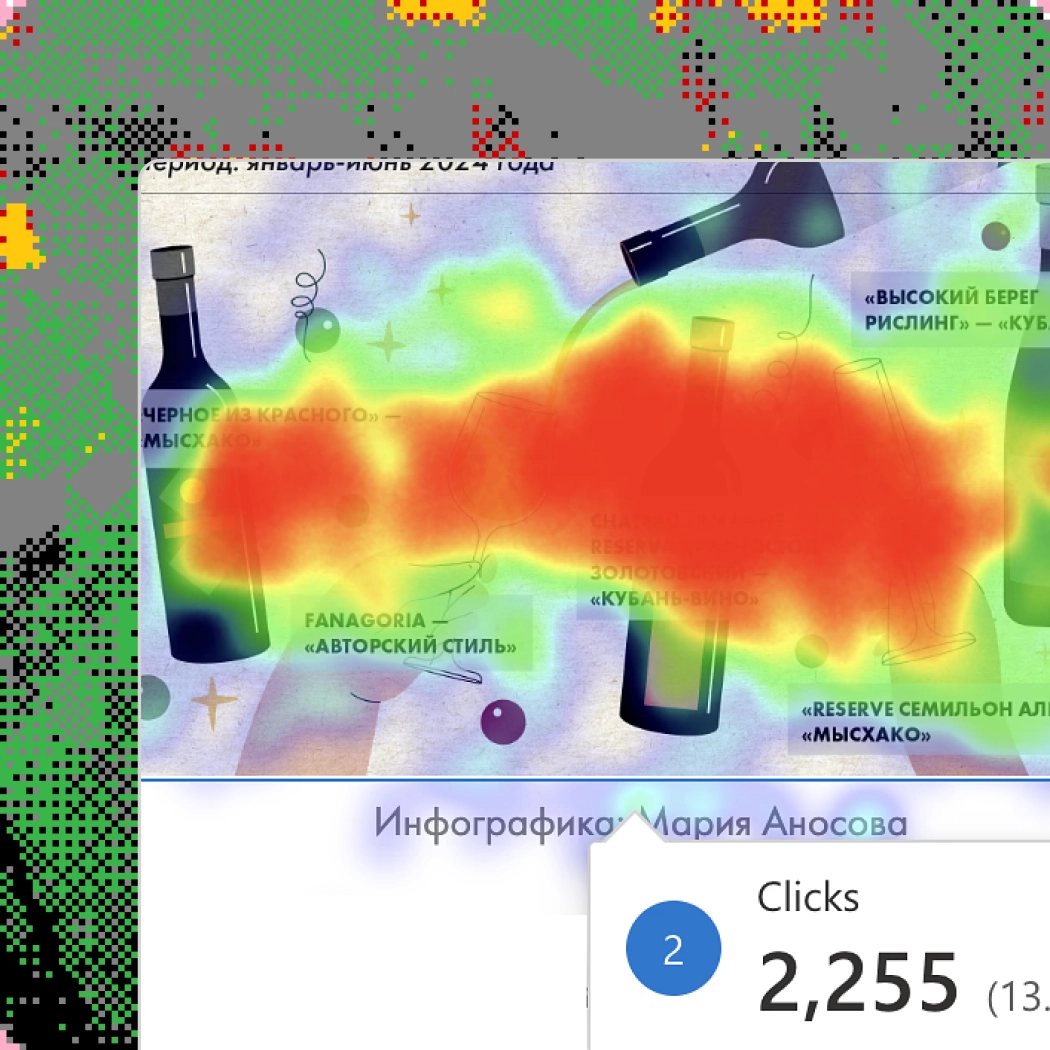
For the wider platform, I combined this feedback with Yandex Metrika data and Microsoft Clarity heatmaps and session recordings. This helped separate visible design imperfections from problems genuinely affecting user behavior.
I looked for repeated patterns:
- places where readers clicked but received no response;
- pages with weak navigation or unclear hierarchy;
- inconsistent behavior between desktop and mobile;
- legacy patterns slowing design and development;
- accessibility and performance problems affecting many page types.
I prioritized work by reach, severity, and implementation effort. This produced a mix of broad redesign work and smaller targeted improvements. Some of the smallest changes delivered the clearest measurable results.
Redesigning core reading and discovery journeys
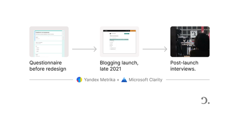
The redesign covered the blogging product, main page, article and quiz experiences, author and tag pages, event pages, FAQs, and other recurring content patterns. Instead of treating every page as a separate composition, I focused on the journeys connecting them: publishing a post, discovering an article, understanding its context, continuing to related content, and reading comfortably across screen sizes.
The work included:
- clarifying content hierarchy and navigation;
- improving article readability and responsive behavior;
- making related authors, topics, and content easier to discover;
- redesigning quiz pages for desktop and mobile;
- improving event information and registration flows;
- standardizing repeated patterns across old and new pages;
- reviewing keyboard interaction, focus states, and skip navigation with engineers.
The goal was consistency without making the publication feel generic. New patterns had to support a wide range of editorial material while still feeling recognizably Snob.


Supporting editorial work
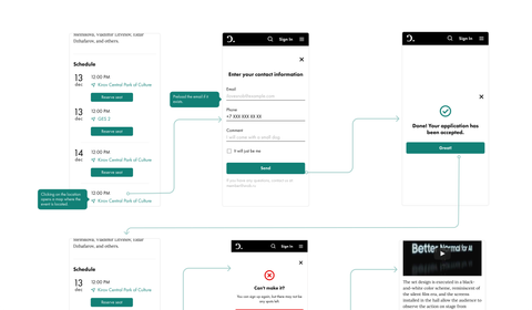
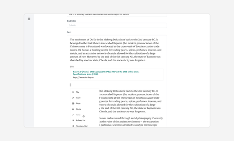
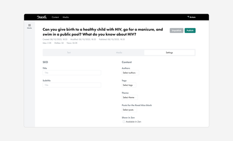
Alongside the reader-facing redesign, I worked on tools used by writers and editors. These included article-creation controls, SEO fields, image uploads, captions and sources, and media-management workflows.
I’ve kept this section brief to keep the main case focused on the reader-facing product. The editorial system can become a separate deep dive where its more complex workflows can be explained properly.
Turning the redesign into a reusable system
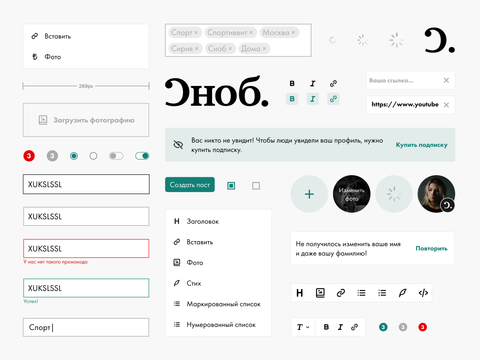
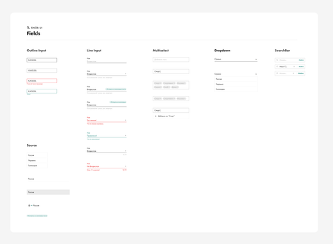
A page-by-page redesign would have created another generation of one-off solutions. I built and maintained a UI library containing 530+ components and variants, supporting approximately 50 pages across the product.
The library gave the team a shared reference for typography, controls, content modules, states, and responsive behavior. It also helped us standardize legacy pages gradually instead of waiting for a complete platform rebuild.
This reduced repeated design work, made handoff clearer, and gave the team a more reliable base for new features and special projects.
Accessibility as part of the product work
Accessibility was included in design and engineering discussions throughout the work. I reviewed keyboard behavior, introduced clearer focus treatment and skip-navigation patterns, and worked with engineers to make important interactions usable without relying only on a pointer.
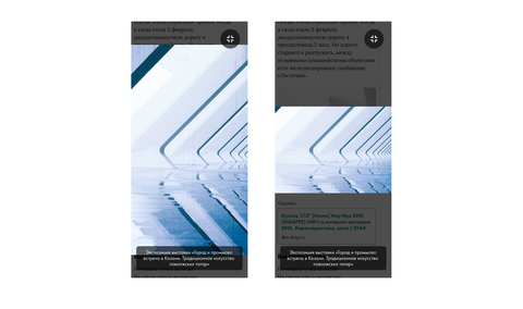
One example came from article images. Microsoft Clarity showed readers repeatedly clicking images that looked interactive but did nothing. I proposed a full-screen zoom experience with keyboard support and clear interaction feedback. After release, dead clicks on article images decreased by 17%.
This became a useful pattern for the wider redesign: accessibility, expected behavior, and measurable usability improvements often supported the same solution rather than competing with one another.

Improving perceived performance through typography
The platform used Futura PT, but its Arial and Helvetica fallbacks had significantly different metrics. While Futura PT loaded, text rewrapped and caused visible movement. I identified the mismatch, tuned metric-compatible fallbacks, and wrote production CSS using size-adjust; developers implemented it.
Between 18 February and 3 March 2025, mobile URLs flagged by Google Search Console for LCP above 2.5 seconds fell from 7,061 to 3,831 — a 45% decrease. Because other design changes shipped during the same period, I treat the fallback update as a plausible contributor rather than the sole cause.
Outcomes
Comparing Yandex Metrika data for the year before the redesign with the year after it:
- visits increased by 50%;
- time on site increased by 38%.
Focused follow-up improvements produced additional measurable results:
- pages with high LCP decreased by 45%, from 7,061 to 3,831;
- dead clicks on article images decreased by 17%.
The redesign also produced a reusable library of 530+ components and variants supporting approximately 50 pages.
The traffic and engagement changes were the result of cross-functional product, editorial, technical, SEO, advertising, and commercial work. My contribution was the UX scenarios and visual system supporting that wider effort.
What I learned
Working on a high-traffic legacy product changed how I think about redesigns. Large visual changes are not automatically the most valuable ones. The strongest work often came from identifying a specific behavioral or technical problem, choosing a proportionate solution, and measuring what changed after release.
It also reinforced the value of systems. A reusable component, a better fallback font, or a well-defined interaction pattern can improve many pages at once. At this scale, consistency and implementation details are product decisions.
Deep dives