Matching Fallback Fonts to Futura PT Across 7,000+ Mobile URLs
Snob.ru is a media platform with more than 6 million monthly visits. Its interface uses Futura PT, but the browser displayed Arial or Helvetica while the web font loaded. Because their proportions did not match Futura PT, headlines and body text changed width, wrapping, and height when the final font appeared.
I identified the mismatch, built a comparison experiment, tuned the fallbacks, and wrote the production CSS for developer handoff. After implementation, the number of mobile URLs that Google Search Console flagged for LCP above 2.5 seconds fell from 7,061 to 3,831 — a 45% decrease.
Role: Product Designer — issue identification, experiment, production CSS, and developer handoff
Scope: Platform typography across desktop and mobile
Evidence: Manual font comparison, a dated internal SEO report, and Google Search Console field data
Measurement: 18 February to 3 March 2025
A visual detail was affecting the loading experience
Futura PT and the system fallbacks have different character widths, proportions, and weights. While Futura PT was loading, the fallback could fit a different number of characters on each line. Once the web font appeared, headlines rewrapped and text blocks changed height.
The issue was especially visible on content-heavy pages, where a small difference in one line could move everything below it. It was not enough to choose a visually similar fallback: its rendered dimensions also had to stay close to Futura PT.
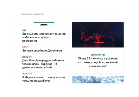
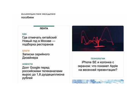
Matching the fallback instead of replacing the brand font
Changing the primary typeface would have removed an established part of Snob.ru's visual identity. I instead tested whether the local fallbacks could be scaled to occupy roughly the same space while Futura PT loaded.
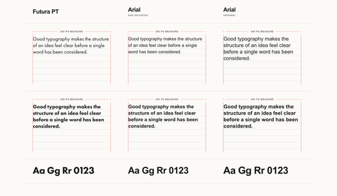
I created a standalone comparison page and adjusted each fallback manually. I compared:
- line wrapping;
- text width;
- text-block height;
- regular and bold weights.
The final values were not chosen by appearance alone. I kept adjusting them until the fallback and Futura PT produced similar line breaks and occupied similar dimensions in representative interface text.
Turning the experiment into production CSS
The final CSS used size-adjust to scale the locally available Arial and Helvetica faces. Regular and bold weights needed different values:
@font-face {
    font-family: 'Arial';
    src: local(Arial Bold);
    size-adjust: 93.5%;
    font-weight: bold;
}

@font-face {
    font-family: 'Arial';
    src: local(Arial);
    size-adjust: 85%;
    font-weight: normal;
}

@font-face {
    font-family: 'Helvetica';
    src: local(Helvetica Bold);
    size-adjust: 93.5%;
    font-weight: bold;
}

@font-face {
    font-family: 'Helvetica';
    src: local(Helvetica);
    size-adjust: 85%;
    font-weight: normal;
}
This did not make the fallback look identical to Futura PT. It made the temporary rendering occupy more comparable space, reducing the visible change when the web font replaced it.
From design investigation to implementation
I owned the work from diagnosis through handoff: I identified the loading issue, created the comparison experiment, selected the values, and supplied production-ready CSS. The developers reviewed the solution and implemented it in the product.
This was a small change in code, but it operated across a large publishing platform. That made careful testing more important than the apparent size of the fix.
Observed result
Snob.ru's SEO specialist recorded 7,061 mobile URLs with LCP above 2.5 seconds on 18 February 2025. On 3 March, Google Search Console showed 3,831 affected URLs — 45% fewer flagged URLs.
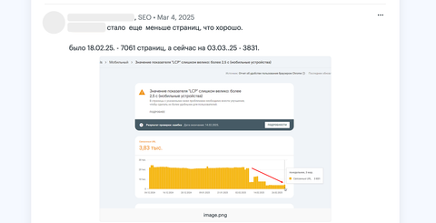
The developers confirmed that the release window contained design changes rather than backend or infrastructure work, so we considered the fallback update a plausible contributor to the improvement.
However, this was not a controlled experiment. Search Console reports aggregated field data, other design changes were released in the same period, and I did not have a separate CLS measurement. I therefore treat the 45% decrease as a post-release outcome, not proof that the fallback CSS caused the entire change.
What this changed in my process
Typography is not only a visual layer. Font metrics can affect wrapping, page movement, and the experience of loading content at platform scale.
This work also reinforced a measurement rule I now follow: distinguish what the implementation directly changes from what the monitoring data later shows. In this case, I could demonstrate closer fallback metrics and less visible reflow; Search Console then showed a strong improvement in the broader LCP signal. Keeping those claims separate makes the result more credible.